Want to know how much unused CSS is on your website? Find out here:
CSS Text Stroke/Outline
Developing content for the web, you may come across the requirement of adding an outline to the text. This article will demonstrate different possibilities for creating text outlines via CSS and their limitations.
Let’s start with the text-shadow property. You may be tempted to think that a plain text-shadow should fulfill our requirement but that is not the case. While it tries to provide a good approximation, the browser has to render the text multiple times and it is not perfect at corners. Let’s see it in action.
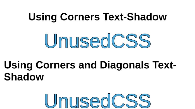
Using 4 Text Shadows
Let’s create a text and add 4 text shadows to it, one for each direction.
.text-outline {
  text-shadow:
    2px 0 black,
    0 -2px black,
    -2px 0 black,
    0 2px black;
}
Zooming in on the result, you can see the corners are not filled in and some curves lack the outline.
Using 8 Box Shadows
We can improve the results by adding diagonal shadows to fill in the corners. The "1.41" values are there to make the diagonal shadows the correct distance. This value is easy to calculate with the following formula: √(R² ÷ 2) (where R is the radius of the stroke). To put it more simply, take the desired stroke width (in this case 2), multiply it by itself (2 × 2 = 4), divide that by 2 (4 ÷ 2 = 2), and then take the square root (√2 = 1.41).
.text-outline-diagonal {
  text-shadow: 1.41px 1.41px black, 2px 0 black, 1.41px -1.41px black,
    0 -2px black, -1.41px -1.41px black, -2px 0 black,
   -1.41px 1.41px black, 0 2px black;
}This required the browser to render the text 9 times. The shadows are improved but still not perfect. If you zoom into the corners, you can still observe steps at the corners.
This technique performs particularly poorly in the case of thicker strokes. The diagonal stroke distances have been calculated in the same way: √(9² ÷ 2) = 6.36
.thick-stroke {
 text-shadow: 6.36px 6.36px black, 9px 0 black, 6.36px -6.36px black, 0 -9px black, -6.36px -6.36px black, -9px 0 black, -6.36px 6.36px black, 0 9px black;
}Using -webkit-text-stroke Property
CSS offers a dedicated property named -webkit-text-stroke which is capable of applying perfect text outline.
.text-outline-stroke {
  -webkit-text-stroke: 1px black;
}
This property has fairly good support across browsers. But to be on the safe side, we can use the text-shadow as a fallback, and only use the -webkit-text-stroke if the browser supports it.
.text-outline {
  text-shadow:
    1.41px 1.41px black,
    2px 0 black,
    1.41px -1.41px black,
    0 -2px black,
    -1.41px -1.41px black,
    -2px 0 black,
    -1.41px 1.41px black,
    0 2px black;
}

@supports (-webkit-text-stroke: 1px black) {
  .text-outline {
    -webkit-text-stroke: 2px black;
    text-shadow: none;
  }
}
This will render the perfect outline on browsers that support it, and the fallback text-shadow outline on browsers that do not.
Zomming-in on the corners, you can observe there are no steps or missed curves - if. your browser supports text-stroke property.
Using SVG Filters
SVG filters are a very handy tool for visually modifying content. There are many filters offered out of the box with flexible, customizable properties. You can apply the filters step-by-step and monitor the output of each. SVG Filters enable theoretically infinite possible effects for the text.
For this article, we will build two outline filters step by step. The first one will build an outline that supports black color only while the second one will be able to draw an outline of any color of your choice.
Note: SVG filter does not quite provide an even stroke all the way around the text. It also does not have any better browser support than -webkit-text-stroke, making the -webkit-text-stroke the best option for most websites, with the text-shadow fallback.
Black Outline
Let’s build the first filter. We can create an outline by taking the text’s alpha-channel/opacity (visually exact text but black colored only as all the other colors are dropped), increasing its thickness (dilating it), and placing the original text on top of it.
We render the original text.
We define the boilerplate of the filter.
<svg xmlns="http://www.w3.org/2000/svg">
  <filter id="outlineBlack">

  </filter>
</svg>
Step 1: Take the source alpha only of the text input using the feMorphology filter.
Note that we are adding code to the original boilerplate step by step, and not defining a new filter.
<svg xmlns="http://www.w3.org/2000/svg">
  <filter id="outlineBlack">
    <feMorphology in="SourceAlpha" />
  </filter>
</svg>Step 2: Dilate (make bigger) the result of source alpha. We will dilate it with a radius of 2. This dilution will become the thickness of the outline. You can adjust the value as per your need.
<svg xmlns="http://www.w3.org/2000/svg">
  <filter id="outlineBlack">
    <feMorphology in="SourceAlpha" result="Dilated" operator="dilate" radius="2" />
  </filter>
</svg>Step 3: Merge the dilated text and the original text. Original text will be placed on top of the alpha. This is the last step and the end visual result will be our text with an outline. We have the final code of the filter and its visual output.
<svg xmlns="http://www.w3.org/2000/svg">
  <filter id="outlineBlack">
    <feMorphology in="SourceAlpha" result="Dilated" operator="dilate" radius="2" />
    <feMerge>
      <feMergeNode in="Outline" />
      <feMergeNode in="SourceGraphic" />
   </feMerge>
 </filter>
</svg>You can now use this filter on the text (or any other element) to get a black outline, with a thickness of your choice. Applying the filter requires only setting the element’s filter attribute in CSS.
.text-outline-svg-black {
  filter: url(#outlineBlack);
}Note: If you need to put the definition of your SVG Filters in the markup of your page without them showing up as text (just like for this article), make sure you wrap them in an absolutely positioned <div> having a width and height of 0 pixels. You may be tempted to wrap in a <div> with display set to none but the filter stops working in that case.
Colored Outline
The step-by-step process behind the second filter will be as follows
- Create a replica of text with increased/dilated thickness
- Create a solid rectangle with the color of your choice
- Compose the text and rectangle together so that only the overlapping pixels of the rectangle are extracted as output. This will essentially complete the process of creating a colored outline
- Merge the text and colored outline into one. The result will be the original text with an outline of the selected color
Let’s build the second filter - one that supports any color for the outline. Here is our original text
We define the boilerplate of the filter.
<svg xmlns="http://www.w3.org/2000/svg">
  <filter id="outlineColored">

  </filter>
</svg>
Step 1: Add an feMorphology filter that takes the source alpha channel (opacity) of the input and dilates it with a radius of 2. This will create a replica of text but with increased thickness. The result is stored in “Dilated”.
<svg xmlns="http://www.w3.org/2000/svg">
  <filter id="outlineColored">
     <feMorphology in="SourceAlpha" result="Dilated" operator="dilate" radius="2" />
  </filter>
</svg>Step 2: Add an feFlood filter to create a solid rectangle. We provide our selected color as a hexcode with the input named flood-color. The result gets stored in “OutlineColor”.
<svg xmlns="http://www.w3.org/2000/svg">
  <filter id="outlineColored">
    <feMorphology in="SourceAlpha" result="Dilated" operator="dilate" radius="2" />
    <feFlood flood-color="#663399" result="OutlineColor" />
  </filter>
</svg>Step 3: Compose the source alpha and the rectangle together using feComposite filter. The feComposite filter uses the "in" operation, which takes each pixel from the "in" attribute. If it overlaps a pixel in the "in2" attribute, then the pixel from "in" is used. Since we have just used the alpha channel in feMorphology, this essentially turns the "in2" attribute into a mask for the "in" attribute, effectively creating a larger version of our original text in a solid color of our choice. This gets stored in "Outline".
<svg xmlns="http://www.w3.org/2000/svg">
  <filter id="outlineColored">
    <feMorphology in="SourceAlpha" result="Dilated" operator="dilate" radius="5" />
    <feFlood flood-color="#663399" result="OutlineColor" />
    <feComposite in="OutlineColor" in2="Dilated" operator="in" result="Outline" />
  </filter>
</svg>
Step 4: Merge the outline and the text. After composing the solid rectangle with our outline mask, we have our colored outline. The last step is to merge the outline and text together using feMerge filter.
<svg xmlns="http://www.w3.org/2000/svg">
  <filter id="outlineColored">
    <feMorphology in="SourceAlpha" result="Dilated" operator="dilate" radius="3" />
    <feFlood flood-color="#663399" result="OutlineColor" />
    <feComposite in="OutlineColor" in2="Dilated" operator="in" result="Outline" />
    <feMerge>
      <feMergeNode in="Outline" />
      <feMergeNode in="SourceGraphic" />
    </feMerge>
  </filter>
</svg>
Now we can apply it to our element using CSS.
.text-outline-svg-colored {
  filter: url(#outlineColored);
}
Here is the complete codepen.
<div class="container">
  <h1>Using Corners Text-Shadow</h1>
  <div class="main-text text-outline">UnusedCSS</div>
  <h1>Using Corners and Diagonals Text-Shadow</h1>
  <div class="main-text text-outline-diagonal">UnusedCSS</div>
  <h1>Using Text Stroke</h1>
  <div class="main-text text-outline-stroke">UnusedCSS</div>
  <h1>Using SVG Filter (Black Outline Only)</h1>
  <div class="main-text text-outline-svg-black">UnusedCSS</div>
  <h1>Using SVG Filter (All Colors Supported)</h1>
  <div class="main-text text-outline-svg-colored">UnusedCSS</div>
</div>

<!--- SVG Filter for outline of only black color -->

<svg xmlns="http://www.w3.org/2000/svg">
  <filter id="outlineBlack">
    <feMorphology in="SourceAlpha" result="dilatedAlpha" operator="dilate" radius="2"></feMorphology>
    <feMerge>
      <feMergeNode in="dilatedAlpha" />
      <feMergeNode in="SourceGraphic" />
    </feMerge>
  </filter>
</svg>

<!--- SVG Filter for outline of any color -->

<svg xmlns="http://www.w3.org/2000/svg">
  <filter id="step1">
    <feMorphology in="SourceAlpha" result="Dilated" operator="dilate" radius="5"></feMorphology>
  </filter>
</svg>

<svg xmlns="http://www.w3.org/2000/svg">
  <filter id="step2">
    <feMorphology in="SourceAlpha" result="Dilated" operator="dilate" radius="5"></feMorphology>
    <feFlood flood-color="#FF0000" result="OutlineColor"></feFlood>
  </filter>
</svg>

<svg xmlns="http://www.w3.org/2000/svg">
  <filter id="step3">
    <feMorphology in="SourceAlpha" result="Dilated" operator="dilate" radius="5"></feMorphology>
    <feFlood flood-color="#FF0000" result="OutlineColor"></feFlood>
    <feComposite in="OutlineColor" in2="Dilated" operator="in" result="Outline"></feComposite>
  </filter>
</svg>


<!-- Complete Working Filter -->
<svg xmlns="http://www.w3.org/2000/svg">
  <filter id="outlineColored">
    <feMorphology in="SourceAlpha" result="Dilated" operator="dilate" radius="3"></feMorphology>
    <feFlood flood-color="#8E44AD" result="OutlineColor"></feFlood>
    <feComposite in="OutlineColor" in2="Dilated" operator="in" result="Outline"></feComposite>
    <feMerge>
      <feMergeNode in="Outline" />
      <feMergeNode in="SourceGraphic" />
    </feMerge>
  </filter>
</svg>
* {
  font-family: sans-serif;
}

body {
  height: 100vh;
  margin: 0;
}

.container {
  display: flex;
  flex-direction: column;
  justify-content: center;
  align-items: center;
  padding: 24px;
}

.main-text {
  font-size: 120px;
  color: #48abe0;
}

.text-outline {
  text-shadow: 2px 0 black, 0 -2px black, -2px 0 black, 0 2px black;
}

.text-outline-diagonal {
  text-shadow: 1.41px 1.41px black, 2px 0 black, 1.41px -1.41px black,
    0 -2px black, -1.41px -1.41px black, -2px 0 black, -1.41px 1.41px black,
    0 2px black;
}

.text-outline-stroke {
  -webkit-text-stroke: 2px black;
}

.text-outline-svg-black {
  filter: url(#outlineBlack);
}

.text-outline-svg-colored {
  filter: url(#outlineColored);
}
Examples
A fancy, multi-line stroke
See the Pen text stroke by Freddy Gomez (@dajama) on CodePen.
Stroked text with decoration
See the Pen stroke text and random deco by Vivi Tseng (@vii120) on CodePen.
Gradient text stroke
See the Pen css gradient text stroke by Vivi Tseng (@vii120) on CodePen.
A fancy mill using text stroke and animation
See the Pen Mill with text-stroke by DP (@coding_dp) on CodePen.
A very subtle text stroke with a background image
See the Pen Text Stroke CSS Mask Effect by Patrick Freedom Mayer (@freedommayer) on CodePen.
UnusedCSS helps website owners remove their unused CSS every day. Sign Up to see how much you could remove.