Improving Perceived Speed With Critical CSS
Modern web browsing is all about first impressions. Google’s PageSpeed Insights benchmark declares a website slow if rendering the first contentful paint (FCP) is higher than 3 seconds. In contrast, a fast FCP is 1 second or less. As such, now more than ever, it is vital to focus on page performance just as much as the content. Even a bloated website can engage a relatively larger audience if it prioritizes the visible content first and makes a better first impression in terms of speed and responsiveness.
What is Critical CSS?
Cascading Style Sheets (CSS) files are the priority to load for most modern web browsers. Most websites have several CSS files that the browser must download and parse before it can start rendering, or painting, the webpage. Along with JS scripts, this makes CSS one of the most common render-blocking resources and the primary reasons for a slow website. This makes it crucial to identify critical CSS styles that can be used to render most of the content on the webpage. Loading these CSS files asynchronously (along with your JavaScript files) lets the browser start rendering content faster, but you need to have something there for your users to see while your CSS files load.
The first part of the webpage that your users see is the above-the-fold (or above-the-scroll) content - the total visible area of a webpage that a user sees on the first visit. Critical CSS is the styling required to display only this critical content. Identifying the critical CSS and inlining it in the <head> tag ensures the user can be engaged as the remainder of the website and your CSS files load in the background.
Viewport Sizes
It gets slightly more complicated though because your users will use all sorts of different sized devices, each with different viewport sizes. A viewport size is slightly different from the number of pixels available on your device's screen. The viewport size is like a "virtual" screen resolution, which is often less than the available number of pixels to make sure the text on your screen isn't too small to read. It's important to generate critical CSS for a few viewport sizes because if you simply generated your critical CSS for a desktop size viewport, then your mobile users might not see their responsive styles in the above-the-fold content while the page is still loading.
Why inlining Critical CSS is important?
Inlining critical CSS means identifying the critical CSS and including it in a <style> tag inside the <head> section of the webpage. Identifying and inlining critical CSS is a key step to improve the performance of a webpage. It is also one of the basic methods to resolve the “eliminate render-blocking resources” error message on common performance benchmarking tools online such as PageSpeed Insights and WebPageTest. Loading the critical content within the good threshold (under 1s) generally translates to higher user engagement and conversion rates.
When to inline critical CSS
Inlining all critical CSS may seem like the best idea but this is where web standards kick in. The size limit for the first Transmission Control Protocol (TCP) packet is 14.6 KB. As a general rule of thumb, the first request from the browser should be returned with the most critical data. For a webpage, this means all the HTML code including the inlined critical CSS should altogether be less than the size limit of 14.6 KB after gzip, deflate, or brotli compression. This gives you approximately 70 KB (for gzip) or 85 KB (for brotli) of raw HTML, depending on your content. While some frontend developers prefer to only minify the CSS files to improve performance, it should be understood that since both inlined critical CSS and the external CSS file can load together.
The good news is that you don't need to inline critical CSS for your whole website. Once the user has visited your landing page (and it loaded quickly because you inlined your critical CSS), they have then downloaded and cached your external CSS files in their browser (you are using browser caching, right?). Each subsequent page they visit no longer needs critical CSS inlined because it's already all downloaded. Therefore, it makes sense to only inline critical CSS on your most important landing pages, and leave the browser cache to handle your other pages.
How to generate Critical CSS using UnusedCSS
Identifying critical CSS looks like a daunting task. Reading through hundreds or thousands of lines of CSS code is time-consuming. Thankfully, there are plentiful free tools for automating the process, UnusedCSS being one of them. UnusedCSS has the added benefit of generating the critical CSS for multiple viewport sizes.
You can improve the performance of your website’s landing page (or any other page as well) in four simple steps using the new Landing Pages feature in UnusedCSS:
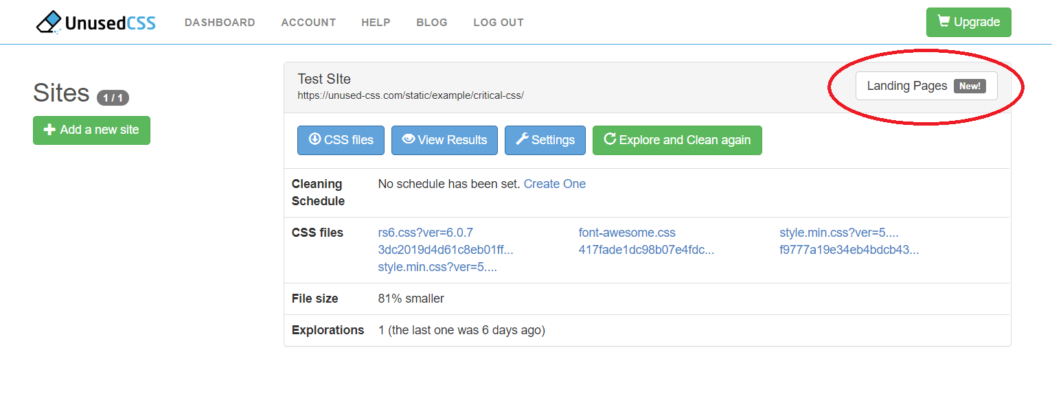
- Navigate to your UnusedCSS dashboard and click the “Landing Pages” button in the top right corner of your screen:

- On the Landing Pages screen, click the “Add a New Landing Page button” in the top left section.
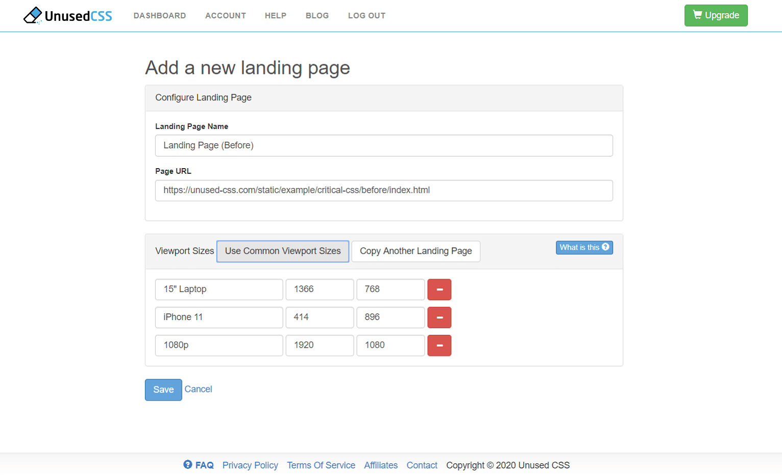
- In the Add a New Landing Page screen, you have two sections:

- Configure Landing Page
- Landing Page Name: Enter a custom name for your landing page. This is a unique identification for the landing page. This can be edited later.
- Page URL: Your landing page’s URL goes here. This allows UnusedCSS to fetch your website’s landing page for processing.
- Viewport Sizes (see Viewport Sizes)
- Use Common Viewport Sizes: This button creates three standard preset viewport sizes for laptop (1366x768), iPhone 11 (414x896), and 1080p (1920x1080). You can edit these as well.
- Alternatively, you may also fill in the device name manually with the viewport’s width and height in pixels. You may add up to three viewports for generating critical CSS on the free account. Paid accounts can add more.
- Configure Landing Page
- Once you have filled out all the required options, click the Save button.
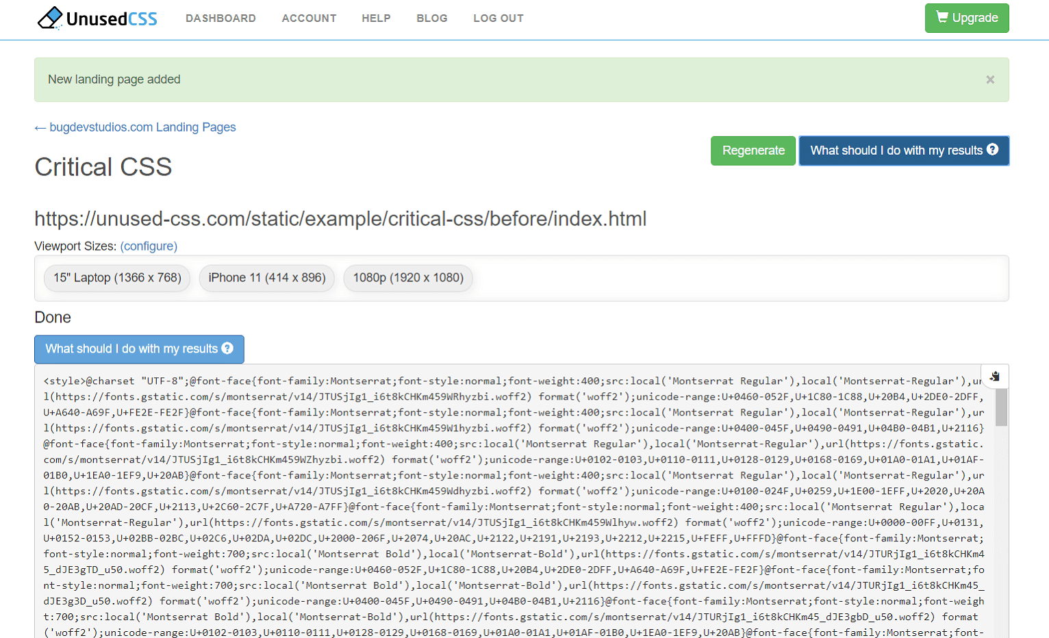
You should now be on the Critical CSS page. Please wait a few moments while UnusedCSS generates your inlined critical CSS:
The generated critical CSS should be pasted into the <head> section of your HTML document. Be sure to replace any previously generated critical CSS.
To load all the other CSS files asynchronously, the current recommendation is to set the CSS file media type to "print" and use an onload handler to change the media type to "screen" once the file has been downloaded. For example, if your CSS file looks like this:
<link rel="stylesheet" href="path/to/mystylesheet.css">
Then it should be replaced with a link which looks like this:
<link rel="stylesheet" href="path/to/mystylesheet.css" media="print" onload="this.media='all';this.onload=null;">
This will allow the browser to display the above-the-fold content using the critical CSS immediately, without waiting to download the external CSS file first.
The above steps outline a simple method to improve the perceived performance of your landing pages. You may also choose to improve the performance of other pages on your website as well.
Benchmarking
We found a starter bootstrap template and created a landing page before generating critical CSS. Here is the landing page without critical CSS, hosted in New Jersey. This page was tested using SiteSpeed.io’s performance benchmarking from a server in London (UK) with the following results:
Without Critical CSS
|
Metric |
Test 1 |
Test 2 |
Test 3 |
Average |
|
FirstPaint |
903 |
844 |
1,164 |
970 |
|
BackEndTime |
255 |
259 |
293 |
269 |
|
ServerResponseTime |
75 |
86 |
86 |
82 |
|
Last Visual Change |
1,402 |
1,367 |
1,533 |
1,434 |
We then generated Critical CSS using the Landing Pages feature of Unused CSS.
Just for fun, we created a copy of the page with just the critical CSS inlined and no external CSS files. You can see that the above-the-fold content looks correct. If you scroll down a bit, the about and contact sections are missing their styles.
Then we created the final landing page with critical CSS inlined and external CSS files loaded asynchronously using loadCSS. Here are the performance results from the same tests:
Critical CSS Inlined
|
Metric |
Test 1 |
Test 2 |
Test 3 |
Average |
|
FirstPaint |
716 |
742 |
681 |
713 |
|
BackEndTime |
262 |
262 |
239 |
254 |
|
ServerResponseTime |
78 |
80 |
72 |
77 |
|
Last Visual Change |
1,333 |
1,400 |
1,334 |
1,356 |
The most interesting metric of the benchmark results is the FirstPaint time. We can see that after generating and inlining critical CSS, the average FirstPaint time is improved by 257 ms which is a noticeable improvement over the starter template. The Last Visual Change metric is also slightly improved by 78ms but remains practically in the same range. The two metrics show that despite the slight increase in the web page size, the perceived performance and user experience has been improved.
Google PageSpeed Insights
Many users grapple with the "Eliminate render-blocking resources" error in PageSpeed Insights. Inlining critical CSS is one step to doing this (loading JavaScript asynchronously is another). In our landing page example, JavaScript was already loaded asynchronously. Inlining critical CSS was the last step to fix the "Eliminate render-blocking resources" error in PageSpeed Insights and improved the page score by 5 points. While this isn't going to improve the Google rankings of our lovely landing page on its own, it's a step in the right direction.
Conclusion
Generating and inlining critical CSS is a useful feature to improve the performance of most websites, especially the landing pages. The new Landing Page feature of UnusedCSS allows you to generate critical CSS automatically using four easy steps. The account options are free (up to 3 landing pages total, with 3 viewport sizes), basic (up to 8 landing pages per site, with 8 viewport sizes), and premium (up to 40 landing pages per site, with 16 viewport sizes).
If you want to see the new Landing Pages feature of UnusedCSS in action, go ahead and sign up for a free account and get started today.