Want to know how much unused CSS is on your website? Find out here:
Animated Scroll Down Arrow
There are cases where you want to bring your user’s attention towards what lies below the scroll. A site can have multiple folds of important content. The user's screen is finite and you don’t want them to leave without scrolling down.
The problem at hand is not communicating to the user about the presence of content below the fold - rather convincing them to scroll and see what the content down there has to offer.
How to go about it?
Having an emphasized scroll indicator is a solution. This works deep down to the user's subconscious, but perhaps that is a discussion for some other forum.
Before we see some examples of attention-catchy down arrows, let’s build the most basic one from scratch.
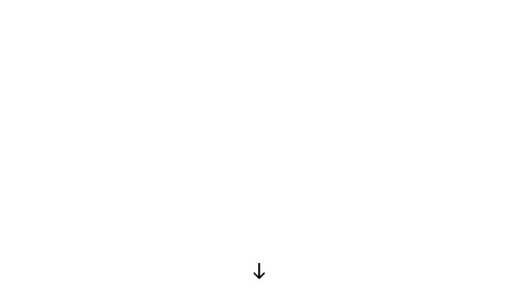
Basic Example
<div class="down-arrow"></div>
.down-arrow {
  position: absolute;
  top: calc(100vh - 60px);
  left: calc(50% - 14px);
  width: 0;
  height: 30px;
  border: 2px solid;
  border-radius: 2px;
}

.down-arrow:after {
  content: " ";
  position: absolute;
  top: 12px;
  left: -10px;
  width: 16px;
  height: 16px;
  border-bottom: 4px solid;
  border-right: 4px solid;
  border-radius: 4px;
  transform: rotateZ(45deg);
}
This is one of the most basic down arrows you can build with plain HTML and CSS.
Let’s animate this arrow to make it look alive and demand the user’s attention.
@keyframes jumpInfinite {
  0% {
    margin-top: 0;
  }
  50% {
    margin-top: 20px;
  }
  100% {
    margin-top: 0;
  }
}
To our .down-arrow class, we add an infinite up and down animation.
.down-arrow {
  // rest of the styles from above
  animation: jumpInfinite 1.5s infinite;
}
This is what our final example looks like:
HTML Code
<div class="down-arrow"></div>
CSS Code
.down-arrow {
  position: absolute;
  top: calc(100vh - 80px);
  left: calc(50% - 14px);
  width: 0;
  height: 30px;
  border: 2px solid;
  border-radius: 2px;
  animation: jumpInfinite 1.5s infinite;
}

.down-arrow:after {
  content: " ";
  position: absolute;
  top: 12px;
  left: -10px;
  width: 16px;
  height: 16px;
  border-bottom: 4px solid;
  border-right: 4px solid;
  border-radius: 4px;
  transform: rotateZ(45deg);
}

@keyframes jumpInfinite {
  0% {
    margin-top: 0;
  }
  50% {
    margin-top: 20px;
  }
  100% {
    margin-top: 0;
  }
}
This is how we can build a simple, but practical, down-arrow calling for scroll-worthy attention. Don’t forget, this is just a very basic example. Leveraging the power of CSS, the look and feel of it can be enhanced greatly.
Let’s take a look at some of the more stylistic and enhanced implementations.
Simple But Elegant
Based on your website theme, you may choose to have simple but elegant scroll arrows. These do not take up much space and are not animation-heavy with any effects that may potentially affect the focus of a user who is aware of the scrolling functionality but doesn’t need to scroll.
See the Pen Scroll Down Arrow by Matthew Hirsch (@matthewhirsch) on CodePen.
See the Pen scroll down arrow by priyanka (@priyankal) on CodePen.
See the Pen Simple use of Jquery Waypoints Plugin by Troy Slaten (@supersarap) on CodePen.
Faders
Do you like the fade-in-out effect? These CodePens have got you covered. They demonstrate an effect of styling proportional to the length of scrolled content.
See the Pen svg scroll down arrow by junjun (@postor) on CodePen.
See the Pen scroll-down icon by Max Ma (@maxshine) on CodePen.
See the Pen scroll down arrow animation by Mohan Raj (@mohanraj0411) on CodePen.
Glowers
Some sites prefer a subtle design, where small but carefully designed and well-presented details can catch the user’s attention. One such elegance is a glowing effect.
See the Pen Scroll Down Arrow by _j_ (@Hoebink) on CodePen.
See the Pen Glowing Scroll Arrow CSS Animation by Robin Bastien (@ocuarharmony) on CodePen.
Intuitives
Another UX is to present a technically intuitive design. In such scenarios, the design offers a direction that is physically relatable for the user. We depict the facility that we need the user to recognize in a manner that relates to real-life objects.
One such instance is to show a mouse icon with the scroll arrow effect.
See the Pen Amazing Mouse-scroll button by Jose David Fumo (@josedavidfumo) on CodePen.
Reactive
In most cases, designers may prefer an experience that reacts to the required user action, acknowledging that the communication is complete. One such instance can be a scroll arrow that fades away when you start scrolling, instead of remaining visible for all folds till the end of the content is reached.
See the Pen Scroll down arrow fades away after scrolling started by Irshad Ahamed (@irshadav) on CodePen.
Conclusion
There are multiple ways of directing your user’s attention to the content below the fold. Given that it could affect your site’s engagement, you should invest time and energy in building a catchy indicator for the user that compels them to scroll down. While there are many designs that you can use, the key features that every pointer should have can be summarized to:
- It should be in an area visible to the user
- It should have a dynamic feel to stand out and catch the user's attention. For instance:
- Animation
- Glowing effects
- Enhanced focus (Particles, Lightning, etc)
UnusedCSS helps website owners remove their unused CSS every day. Sign Up to see how much you could remove.