Need to improve your PageSpeed score? Enter your website address to see how much CSS you can remove:
Rotate Background Image
Applying background images is a frequent frontend requirement. But at times, we may need to rotate those images in the background without affecting the orientation of content in the foreground. In this article, we will observe how the ::before pseudo-element of CSS can help us achieve the rotation of a background image. We will walk through the step-by-step construction of the following codepen.
<div id="imageContainer">content
</div>
* {
font-family: sans-serif;
}
#imageContainer {
position: relative;
width: calc(100vh - 20px);
height: calc(100vh - 20px);
top: 10px;
left: calc(50% - 50vh + 10px);
background: transparent;
color: white;
overflow: hidden;
}
#imageContainer::before {
content: "";
position: absolute;
width: 100%;
height: 100%;
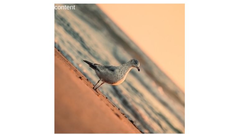
background-image: url("https://unused-css.com/media/seagull.jpg");
background-size: 100% 100%;
transform: rotate(45deg) scale(1.45);
z-index: -1;
}
The first step is to create an element and set its background to be transparent. We do not set a background image on this element directly because we will be using it’s ::before (child) pseudo-element to host the image. To ensure the image doesn’t outgrow the parent element in size, we will hide the overflow.
<div id="imageContainer">
</div>
#imageContainer {
background: transparent;
overflow: hidden;
// General styles are omitted for brevity
}
Let’s provide the ::before pseudo-element with the background image. Note that providing a content attribute, be it an empty string, is necessary for having the pseudo-element generated. We also give it a z-index of -1 so that it does not lay over the content of the foreground which otherwise would get hidden behind the image.
#imageContainer::before {
  content: “”;
  z-index: -1;
  width: 100%;
  height: 100%;
  background-size: 100% 100%;
  background-image: url("https://images.unsplash.com/photo-1634634465913-5bb5600942f2?ixlib=rb-1.2.1&ixid=MnwxMjA3fDB8MHxwaG90by1wYWdlfHx8fGVufDB8fHx8&auto=format&fit=crop&w=1374&q=80");
}
With the image in place, all that is left is to apply rotation on the pseudo-element.
#imageContainer::before {
  transform: rotate(45deg) scale(1.45);
}
When we rotate the pseudo-element, blank space will be introduced at the corners. To get rid of that, we scale up the pseudo-element. The exact value of upscaling will vary in your case. It will be dependent on the aspect ratio of the element and the angle of rotation. One could discover some complex mathematics formula for calculating the precise value but the easier way appears to try the hit & trial approach until the background fully covers the element. And if the aspect ratio of the element can change, additional testing and adjustment will be needed to ensure the same visual results on various screen sizes.
Note that the transformations were not applied to the image but to the element having that image set as its background.
And we are done.
Conclusion
Using ::before or ::after pseudo-selectors, we can apply background images (and more visual enhancements) to elements without manipulating their own properties.
UnusedCSS helps website owners remove their unused CSS every day. Sign Up to see how much you could remove.