Want to know how much unused CSS is on your website? Find out here:
CSS Text Gradient
A CSS gradient is a progression of two or more colors, in a specified manner and direction. The series of colors diffuse into each other smoothly at defined angles. Gradients are soothing visuals that provide a pleasant, aesthetic effect to the viewer.
Some powerful CSS attributes, that we will dive into shortly, allow text elements to visually have an apparent gradient font color. Technically, it is implemented as a transparent font color having a gradient background.
The process to create it is the following short and simple series of steps.
Let’s create a simple text element:
We have a simple <h1> that we will style to have a text gradient.
Let’s give it a max-width of max-content else the gradient behind the text will stretch to the entire available width, and we will be seeing only that small portion that gets rendered behind our text - unless the text is long enough to cover all the width.
<h1 class="linear-gradient">LINEAR GRADIENT</h1>
h1.linear-gradient {
  max-width: max-content;
}
Let’s give it a gradient background:
background: -webkit-linear-gradient(0deg, #000000 0%, #48abe0 100%);
Let’s clip the background to only those regions, where there is text. Note that at his stage, our text gradient is already there, but we can’t see it because of the text’s font color:
background: -webkit-linear-gradient(0deg, #000000 0%, #48abe0 100%);
-webkit-background-clip: text;
Let’s make the color of the text transparent:
background: -webkit-linear-gradient(0deg, #000000 0%, #48abe0 100%);
-webkit-background-clip: text;
-webkit-text-fill-color: transparent;
And that’s it, we have our text gradient, or what we may also call Gradient Text.
Except for the Internet Explorer, the background-clip property has good support from the browsers. While background-clip is not officially supported, the -webkit prefixed version has good support. You can see the support statistics here.
Internet Explorer does not support this property at all, so instead of setting the background to linear-gradient and the color to transparent, we can set the background to -webkit-linear-gradient and the -webkit-text-fill-color to transparent. This allows IE to gracefully fall back to just rendering the text.
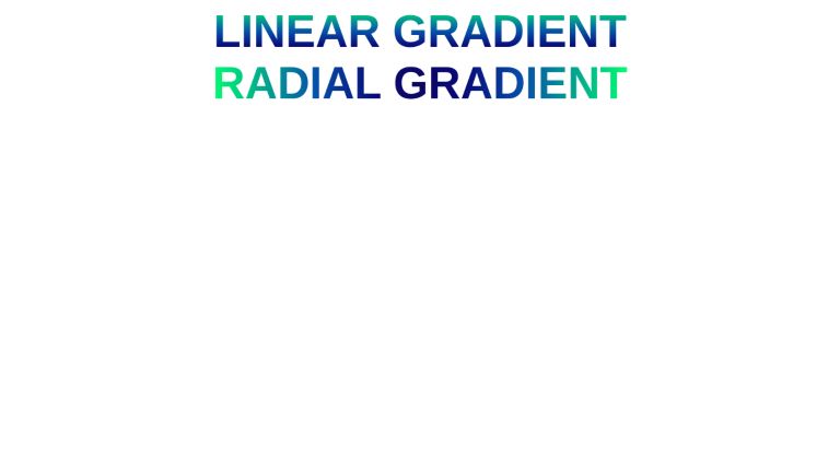
We can leverage all the powerful gradient configurations provided by CSS to customize our gradients. For example, a radial gradient:
background: -webkit-radial-gradient(
  circle,
  rgba(13, 8, 96, 1) 0%,
  rgba(9, 9, 121, 1) 21%,
  rgba(6, 84, 170, 1) 51%,
  rgba(0, 255, 113, 1) 100%
 );
<h1 class="linear-gradient">LINEAR GRADIENT</h1>
<h1 class="radial-gradient">RADIAL GRADIENT</h1>
body {
  font-family: sans-serif;
}

h1 {
  margin: 0 auto;
  font-size: 2rem;
}

h1.linear-gradient {
  background: -webkit-linear-gradient(
    90deg,
    rgba(13, 8, 96, 1) 0%,
    rgba(9, 9, 121, 1) 21%,
    rgba(6, 84, 170, 1) 51%,
    rgba(0, 255, 113, 1) 100%
  );
  -webkit-background-clip: text;
  -webkit-text-fill-color: transparent;
  max-width: max-content;
}

h1.radial-gradient {
  background: radial-gradient(
    circle,
    rgba(13, 8, 96, 1) 0%,
    rgba(9, 9, 121, 1) 21%,
    rgba(6, 84, 170, 1) 51%,
    rgba(0, 255, 113, 1) 100%
  );
  -webkit-background-clip: text;
  -webkit-text-fill-color: transparent;
  max-width: max-content;
}
Conclusion
This is how you can create a text gradient from scratch. For a GUI experience, check out our Text Gradient Generator Tool. It lets you create a text gradient using an intuitive graphical interface and outputs the required design code.
UnusedCSS helps website owners remove their unused CSS every day. Sign Up to see how much you could remove.