Check your site for unused CSS
CSS Multiple Class Selectors
Using multiple class selectors for applying styles to elements is a powerful approach. There are practical use cases when using a single selector is not enough, or adds lesser value than it adds. In this article, we will observe how multiple selectors enhance our style code in a real-life example.
Note that this article is about using multiple class selectors, not combinators. An example of multiple selectors is .class1.class2 - which targets an element having both, class1 and class2, classes. On the other hand, .class1 > .class2 is a combinator that targets all the direct children (not all descendants) of .class1 with the .class2 applied.
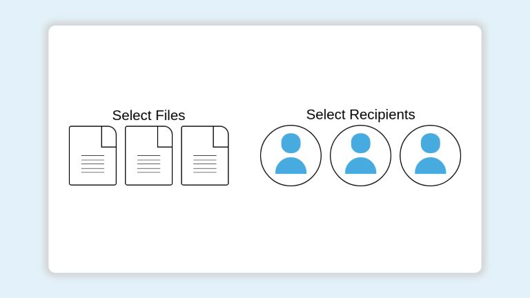
Let’s consider that you are tasked to build a file-sharing UI. It offers the following basic features
- A list of files to select from
- A list of recipients to select from
Both the files and recipients are represented as a grid of icons. Once a file/member is selected, its icon should be styled with a specific design to represent the selection. Both the icon types have different appearances and are required to have different selection styles.
We can use one class .icon to style the default appearance and another class .selected. But the problem is, the icons have different default and selected state styles. Multiple class selectors solve this issue smoothly. We can separate the styles as .file-icon.selected and .recipient-icon.selected rules.
The following codepen demonstrates such a UI and styles. Multiple class selector styles have been placed at the top of styles for emphasis. The general details of the implementation of this UI are out of the scope of this article. Interested readers can go through the codepen to get to know how it has been built.
<div class="file-sharing-card">

  <div>
  <p>Select Files </p>
  <div>
    <span id="file1" class="file-icon" onclick="selectItem('file1')">
      <span class="page-turn"></span>
      <span class="content-lines">
        <span class="line"></span>
        <span class="line"></span>
        <span class="line"></span>
        <span class="line"></span>
        <span class="line"></span>
      </span>
    </span>
    <span id="file2" class="file-icon" onclick=selectItem('file2')>
      <span class="page-turn"></span>
      <span class="content-lines">
        <span class="line"></span>
        <span class="line"></span>
        <span class="line"></span>
        <span class="line"></span>
        <span class="line"></span>
      </span>
    </span>
    <span id="file3" class="file-icon" onclick=selectItem('file3')>
      <span class="page-turn"></span>
      <span class="content-lines">
        <span class="line"></span>
        <span class="line"></span>
        <span class="line"></span>
        <span class="line"></span>
        <span class="line"></span>
      </span>
    </span>
  </div>
  </div>

  <div>
  <p>Select Recipients</p>
  <div>
    <span id="person1" class="avatar" onclick=selectItem('person1')>
      <span class="head"></span>
      <span class="body"></span>
    </span>

    <span id="person2" class="avatar" onclick=selectItem('person2')>
      <span class="head"></span>
      <span class="body"></span>
    </span>

    <span id="person3" class="avatar" onclick=selectItem('person3')>
      <span class="head"></span>
      <span class="body"></span>
    </span>
  </div>
  </div>

</div>
/* Multiple Selectors Demonstration */

span.file-icon:not(.selected):hover,
.file-icon:not(.selected):hover .page-turn {
  border-color: lightgreen;
}

.file-icon:not(.selected):hover .line {
  background-color: lightgreen;
}

span.file-icon.selected {
  background-color: lightgreen;
}

.avatar:not(.selected):hover {
  border-color: lightgreen;
}

.avatar.selected .head,
.avatar.selected .body {
  background-color: lightgreen;
}

/* UI styling */
* {
  font-family: sans-serif;
  margin: 0;
  padding: 0;
}

body {
  background-color: rgba(72, 171, 224, 0.15);
  display: flex;
  justify-content: center;
  align-items: center;
  height: 100vh;
}

.file-sharing-card {
  display: flex;
  justify-content: space-around;
  align-items: center;
  text-align: center;
  background-color: white;
  width: 80%;
  height: 80%;
  padding: 10px;
  border-radius: 15px;
  box-shadow: 0px 0px 15px 9px lightgray;
}

span.file-icon {
  position: relative;
  box-sizing: border-box;
  display: inline-block;
  height: 20vh;
  width: 16vh;
  margin: 5px;
  border: 2px solid black;
  border-radius: 5px;
  border-top-right-radius: 20px;
  cursor: pointer;
}

.file-icon .page-turn {
  display: inline-block;
  height: 35%;
  width: 30%;
  position: absolute;
  right: 0;
  border-left: 2px solid black;
  border-bottom: 2px solid black;
}

.content-lines {
  display: flex;
  flex-direction: column;
  justify-content: space-between;
  position: absolute;
  top: 50%;
  left: 25%;
  width: 50%;
  height: 30%;
}

.content-lines .line {
  height: 1px;
  background: black;
}

.avatar {
  display: inline-block;
  position: relative;
  display: inline-block;
  height: 20vh;
  width: 20vh;
  margin: 5px;
  border: 2px solid black;
  border-radius: 50%;
  cursor: pointer;
}

.avatar .head {
  display: inline-block;
  position: absolute;
  display: inline-block;
  height: 30%;
  width: 30%;
  border: 2px solid transparent;
  border-radius: 20px;
  top: 13%;
  left: 50%;
  transform: translateX(-50%);
  background: #48abe0;
}

.avatar .body {
  display: inline-block;
  position: absolute;
  height: 25%;
  width: 50%;
  border: 2px solid transparent;
  border-radius: 10vh 10vh 0 0;
  top: 53%;
  left: 50%;
  transform: translateX(-50%);
  background: #48abe0;
}
function selectItem(event) {
  var classList = document.getElementById(event).classList;

  if (classList.contains("selected")) classList.remove("selected");
  else classList.add("selected");
}
Multiple CSS class selectors add further value when the states of different elements have partially shared styles. Instead of repeating the style code, we can share the overlapped ones and override the unique ones. Let’s demonstrate this using an example.
Let’s assume we are building a set of messages with highlighted text content that looks like the following:
This text has an important Randommessage
This text has an important Success message.
This text has an important Warning text.
This text has an important Error message.
Our requirements are as follows:
- The highlighted text should be bold and large
- Normal text will be highlighted as blue. Success, Warning, Error states will have Green, Yellow/Gold, Red colors respectively
We quickly note that our normal important texts have a large font-size and blue color.
.important {
  font-size: 1.5rem;
  color: blue;
}
Moving on, we notice that the success, warning, and error texts share the same font size although different colors. Instead of creating a separate class as important-success and repeating the styles besides the unique color, we can share overlapped styles and override unique ones using multiple class selectors.
.important.success {
  color: green;
}

.important.warning {
  color: gold;
}

.important.error {
  color: red;
}
This is a basic example with very few properties. But in real-world codebases, this value addition can save large amounts of code from duplication.
Conclusion
CSS offers a very powerful targeting approach using multiple class selectors. This approach allows easy segregation of styles for different elements while reusing the names of classes. This is particularly handy if the desired name represents a generic state (such as .selected in the above example) but the style requirements are different. It adds even more value when we need to share some styles across multiple elements.
UnusedCSS helps website owners remove their unused CSS every day. Sign Up to see how much you could remove.