Want to know how much unused CSS is on your website? Find out here:
CSS Outer Glow
CSS offers a very powerful property of box-shadow. It enables developers to simulate the drop-shadows - as if our HTML elements are in a true 3D space and can be moved along the z-axis to rise above the background content or submerge in it.
Let’s visualize it by considering the following example. We have two buttons in our view. One is without a box-shadow while the other has it. It can be observed that without a box-shadow, the entire perspective remains 2D as if a button is drawn with a pencil on paper. But with a box-shadow, our brains start to process the view as a 3D perspective. We feel as if the box is a true 3D element, placed or hovering above a true 3D plane. This is the power of box-shadow.
A box-shadow is described by
- Horizontal and Vertical Offsets from the target element’s edges
- Blur Radius
- Spread Radius
- Color
You can explore the details of these properties and experiment with them on the MDN resource page.
Now that we have a brief introduction to the world of box-shadows, we will pay attention to the main topic of this article - outer glow.
The glowing effect is observed when an element radiates steady light around the edges of its body. For example, the effect that can be seen around the edges of the button in the following example.
Let’s create this effect using box-shadow.
Firstly, we will create a black container as glow stands out with a dark background. We will center its content in both dimensions. The content will, in our case, be just a text in a box. We call it simply a card.
<div class="parent">
  <h4>Simple Glow</h4>
  <div class="card">
    <p>Unused CSS</p>
  </div>
</div>
.parent {
  padding: 10rem;
  display: flex;
  flex-direction: column;
  justify-content: center;
  align-items: center;
  background-color: black;
  color: white;
  text-align: center;
}
.card {
  display: flex;
  justify-content: center;
  align-items: center;
  width: 180px;
  padding: 1.5rem;
  margin-top: 25px;
  background: white;
  color: #48abe0;
  text-align: center;
  border-radius: 5px;
  cursor: pointer;
}
We have our card centered in a dark container and the only thing left is the outer glow.
Interestingly, the outer glow is only 1 line of CSS away. We achieve the right blurring of box-shadow by calibrating values of blur and spread radii. For better understanding this, here is the breakdown of how box-shadow is applied:
- First, the browser renders the element as a solid color (of course we get to choose this color)
- Second, the browser then makes this image larger by the spread radius. If the element has a border-radius applied, then the larger image will also have rounded corners. If no border-radius is applied, then the larger image will have square corners
- Thirdly, the browser applies a gaussian blur over the image using the blur radius
Here is a video demonstrating how changing the values of blur and spread radii affects the shadow.
Coming back to the outer glow, let's apply the required CSS declaration.
.card {
  // rest of the styles
  box-shadow: 0 0 50px 15px #48abe0;
}
Note that our overall color scheme, and values for spread and blur radii of the box-shadow matter the most in creating this effect. With the right calibration of these values, we were able to leverage box-shadows to mimic the effect of glowing.
CSS supports the rendering of multiple shadows using a comma-separated list. The shadows are rendered front-to-back in the order of declaration. So the first shadow in the list will be on the front.
Let’s update the box-shadow in the above example to render multiple shadows.
.card {
  // …
  box-shadow: 0 0 10px 5px #48abe0,
              0 0 20px 7px #ebecca,
              0 0 25px 20px #8a2be2,
              0 0 30px 25px #ff1493;
}
Multiple Glows
Text Glow
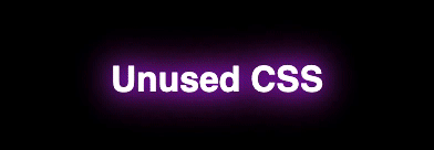
CSS offers another great property that can be leveraged to create glowing effects of texts. The text-shadow property. Consider the following example of text-glow.
Let’s build it from scratch.
<div class=”wrapper”>
 <h2 class=”glow”>Unused CSS</h2>
</div>
.wrapper {
 font-family: sans-serif;
 padding: 10rem;
 display: flex;
 justify-content: center;
 background-color: white;
}
.glow {
 color: white;
 text-shadow: rebeccapurple 0 0 10px;
}
As seen, the glow was added easily using one line of CSS - the text-shadow.
text-shadow: rebeccapurple 0 0 10px;
We can even apply transitions to box-shadow and text shadows to create eye-catching effects. For example, such transitions can mimic Neon Signs.
Let’s animate into our above examples, a transition of text-shadow colors. Note that we need to set the same shadow in the initial (0% frame) and final (100% frame) state of the animation. Otherwise, we will see a glitch as the final shadow color will immediately change to the initial shadow color when the animation loop resets.
 @keyframes shadows {
 0% { text-shadow: #48abe0 0 0 10px; }
 50% { text-shadow: blueviolet 0 0 10px; }
 75% { text-shadow: rebeccapurple 0 0 10px;}
 100% { text-shadow: #48abe0 0 0 10px; }
}
h2 {
 // ...
 animation: shadows 2s infinite
}
The same applies to box shadows. Following codepen demonstrates both, outer and text glow, and their animation.
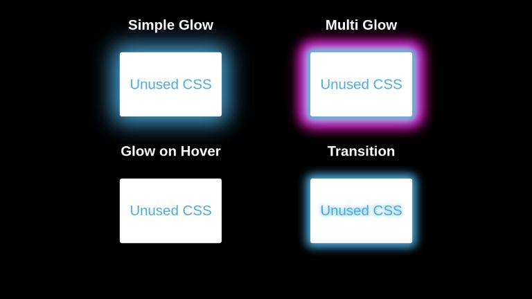
<div class="parent">

  <div class="glow-item">
    <h4>Simple Glow</h4>
    <div class="card">
      <p>Unused CSS</p>
    </div>
  </div>

  <div class="glow-item multi-glow">
    <h4>Multi Glow</h4>
    <div class="card">
      <p>Unused CSS</p>
    </div>
  </div>

  <div class="glow-item">
    <h4>Glow on Hover</h4>
    <div class="card reactive">
      <p>Unused CSS</p>
    </div>
  </div>

  <div class="glow-item">
    <h4>Transition</h4>
    <div class="card shadow-animate">
      <p>Unused CSS</p>
    </div>
  </div>
</div>
body {
  font-family: sans-serif;
  background-color: black;
}

.parent {
  display: flex;
  flex-direction: row;
  justify-content: center;
  align-items: center;
  flex-wrap: wrap;
}

.parent h4 {
  color: white;
  margin-top : 0;
}

.glow-item {
  text-align: center;
  margin: 30px 100px;
}

.card {
  width: fit-content;
  height: fit-content;
  padding: 0.7rem;
  display: flex;
  justify-content: center;
  align-items: center;
  background: white;
  color: #48abe0;
  text-align: center;
  border-radius: 5px;
  cursor: pointer;
  box-shadow: 0 0 50px 15px #48abe0;
}

.card.reactive {
  box-shadow: none;
}

.card.reactive:hover {
  box-shadow: 0 0 50px 15px #48abe0;
}

.multi-glow .card {
  box-shadow: 0 0 10px 5px #48abe0,
              0 0 20px 7px #ebecca,
              0 0 25px 20px #8a2be2,
              0 0 30px 25px #ff1493;
}

.card.shadow-animate {
  box-shadow: 0px 0px 20px 10px #48abe0;
  animation: shadows 1.5s infinite;
}

@keyframes shadows {
  0% {
    text-shadow: #48abe0 0 0 10px;
    box-shadow: 0px 0px 20px 10px #48abe0;
  }
  50% {
    text-shadow: blueviolet 0 0 10px;
    box-shadow: 0px 0px 20px 10px blueviolet;
  }
  75% {
    text-shadow: rebeccapurple 0 0 10px;
    box-shadow: 0px 0px 20px 10px rebeccapuprle;
  }
  100% {
    text-shadow: #48abe0 0 0 10px;
    box-shadow: 0px 0px 20px 10px #48abe0;
  }
}
Examples
A glowing login card.
See the Pen Simple cyan log-in page by Usiph (@USIPH) on CodePen.
Futuristic cards.
See the Pen Futuristic Card Designs by Sebastian Alvarez (@immrseabass) on CodePen.
Glowing social medial icons.
See the Pen CSS Glowing Icons · BEM Method · FontAwesome Kit Code - No Bootstrap by Esther White (@esteecodes) on CodePen.
Buttons with neon effect.
See the Pen Button neon effect by Salih Benlalla (@salihbenlalla) on CodePen.
Transitioning glow on text - An effect useful for navigating the user’s focus.
See the Pen Text Effect --15 --Glow Effect by kiran raj r (@kiran-r-raj) on CodePen.
Conclusion
Box-Shadow and Text-Shadow are very useful properties. Using the right calibration of values, we can create attractive glow effects that can navigate users’ focus while adding to the stylistic beauty of our web pages.
UnusedCSS helps website owners remove their unused CSS every day. See how much you could save on your website: