Check how much unused CSS you have on your website:
CSS Partial Borders
At times one needs to create partial borders for elements. Partial borders are not offered out-of-the-box by CSS. But that doesn’t stop us from creating them ourselves. In this article, we will see various techniques for implementing different types of partial borders.
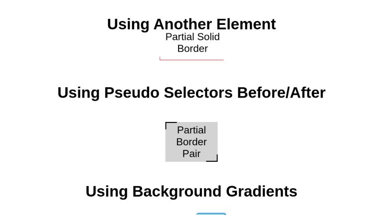
Using Separate Element
One of the simplest techniques is to wrap your target element in another element and apply borders to the wrapper. Why not apply directly to the target? Because we need to control the width of the borders without altering the width and height of the target element. Let’s demonstrate this with code.
Let’s create our element and wrap it.
<div class=’wrapper’>
 <p class=’target’>Partial Solid Border</p>
</div>
Our wrapper will be positioned relatively. The target element’s position will refer to its wrapper.
.wrapper {
  position: relative;
}

.target {
  position: absolute;
}
The wrapper will have dimensions equal to the dimensions of the partial border we require. Moreover, it will have borders defined for the sides as per our requirements. In this example, we will create a partial bottom-left border.
 .wrapper {
  position: relative;
  height: 10px;
  width: 75px;
  margin: 25px auto;
  border-bottom: 1px solid red;
  border-left: 1px solid red;
  text-align: center;
}

.target {
  position: absolute;
  width: max-content;
  bottom: -15px;
  left: 3px;
  border: none;
}
Note that if we want the width of the border to be less than the target, we need to set the width of the target to max-content so that it is not wrapped.
Partial Solid Border
There we go. If you need to move the position of the border, just set the border values and target offset accordingly. For instance, if we want this border to occur on Top Right, all we need to do is to set the values of border-top and border-right, instead of border-left and border-bottom, and position the target element with a right and top offset instead of left and bottom. Apart from that, we’ll need to adjust spacing as required visually.
.partial-border-wrapper {
  position: relative;
  height: 10px;
  width: 55px;
  margin: 25px auto;
  border-top: 1px solid red;
  border-right: 1px solid red;
  text-align: center;
 }

.partial-border-target {
  position: absolute;
  width: max-content;
  top: 2px;
  right: 3px;
  margin: 0;
  border: none;
 }
Partial Solid Border
Using ::before and ::after Pseudo Elements
CSS offers two powerful Pseudo Elements ::before and ::after. These elements allow us to add content to the target element before and after its main content. We have complete freedom to style the inserted content. And we can style them to look like partial borders.
The breakdown of building this partial border is as follows:
- The target element is relatively positioned so that the pseudo-elements can be absolutely positioned within it
- Pseudo-elements are given dimensions equal to the required border dimensions
- Pseudo-Elements are given border sides based on requirements and placed with corresponding zero offsets
Let’s demonstrate by building a pair of top-left and bottom-right borders as seen in the following example.
Let’s create our target element and apply basic styles to it.
<div class="pseudo-partial-border">Pseudo Partial Border</div>
.pseudo-partial-border {
  position: relative;
  width: 250px;
  height: 41px;
  padding: 7px;
  margin: 25px;
  background: lightgray;
  border: none;
  text-align: center;
}
We want our pseudo-elements to be positioned with reference to our target element. Dimensions for pseudo-elements will be as per the design requirements.
.pseudo-partial-border::before,
.pseudo-partial-border::after {
  position: absolute;
  width: 33px;
  height: 20px;
  content: "";
}
Note that providing an empty string as content property is necessary for the visibility of these pseudo-elements.
We want our ::before pseudo-element to have a top-left border.
.pseudo-partial-border::before {
  left: 0;
  top: 0;
  border-left: 3px solid black;
  border-top: 3px solid black;
 }
Similarly, we want ::after pseudo-element to provide the bottom-right border.
.pseudo-partial-border::after {
  right: 0;
  bottom: 0;
  border-right: 3px solid black;
  border-bottom: 3px solid black;
 }
And there we go, we have our partial border pair.
Using Background Gradients
Another technique to achieve partial borders is to use a well-calibrated background built using gradients. The angle, positioning, gap, alignment, and overlapping of gradients are carefully adjusted in a way that the resultant layer appears as a partial border.
Here’s an example.
.partial-border-gradient {
  width: 217px;
  margin: 25px auto;
  box-sizing:border-box;
  text-align: center;
  border-radius: 8px;
  background: radial-gradient(circle at 100% 100%, #ffffff 0, #ffffff 3px, transparent 3px) 0% 0%/8px 8px no-repeat,
              radial-gradient(circle at 0 100%, #ffffff 0, #ffffff 3px, transparent 3px) 100% 0%/8px 8px no-repeat,
              radial-gradient(circle at 100% 0, #ffffff 0, #ffffff 3px, transparent 3px) 0% 100%/8px 8px no-repeat,
              radial-gradient(circle at 0 0, #ffffff 0, #ffffff 3px, transparent 3px) 100% 100%/8px 8px no-repeat,
              linear-gradient(#ffffff, #ffffff) 50% 50%/calc(100% - 10px) calc(100% - 16px) no-repeat,
              linear-gradient(#ffffff, #ffffff) 50% 50%/calc(100% - 16px) calc(100% - 10px) no-repeat,
              linear-gradient(147deg, transparent 25%, #48abe0 25%, #48abe0 50%, transparent 50%, transparent 75%, #48abe0 75%)
}
Partial Gradient Border
Essentially, it works by drawing the gradient across the entire background, then fills the middle bit in. Filling the middle in is easy if the border-radius is less than the border-width, since the inner corners of the border are square. In this case, we can just draw a rectangle over the middle. If the border-radius is bigger than the border-width, then we need to fill it in with multiple radial/linear gradients.
A similar concept has been used in this codepen. While it allows for a transparent background, the types of gradients that are supported are more limited.
<h2>Using Another Element</h2>
<div class="partial-border-element-wrapper">
  <p class="partial-border-element-target">
   Partial Solid Border
  </p>
</div>

<h2>Using Pseudo Selectors Before/After</h2>
<div class="partial-border-pseudo">Partial Border Pair</div>

<h2>Using Background Gradients</h2>
<div class="partial-border-gradient">
  <p>Partial Gradient Border</p>
</div>
body {
  font-family: sans-serif;
  display: flex;
  flex-direction: column;
  align-items: center;
}

p {
  text-align: center;
}

.partial-border-gradient {
  width: 217px;
  background: radial-gradient(circle at 100% 100%, #ffffff 0, #ffffff 3px, transparent 3px) 0% 0%/8px 8px no-repeat,
              radial-gradient(circle at 0 100%, #ffffff 0, #ffffff 3px, transparent 3px) 100% 0%/8px 8px no-repeat,
              radial-gradient(circle at 100% 0, #ffffff 0, #ffffff 3px, transparent 3px) 0% 100%/8px 8px no-repeat,
              radial-gradient(circle at 0 0, #ffffff 0, #ffffff 3px, transparent 3px) 100% 100%/8px 8px no-repeat,
              linear-gradient(#ffffff, #ffffff) 50% 50%/calc(100% - 10px) calc(100% - 16px) no-repeat,
              linear-gradient(#ffffff, #ffffff) 50% 50%/calc(100% - 16px) calc(100% - 10px) no-repeat,
              linear-gradient(147deg, transparent 25%, #48abe0 25%, #48abe0 50%, transparent 50%, transparent 75%, #48abe0 75%);
  border-radius: 8px;
  padding: 9px;
  box-sizing: border-box;
}

.partial-border-element-wrapper {
  position: relative;
  height: 10px;
  width: 200px;
  margin: 35px 0;
  border-bottom: 1px solid red;
  border-left: 1px solid red;
}

.partial-border-element-target {
  position: absolute;
  width: inherit;
  bottom: -15px;
  left: 3px;
  border: none;
}

div.partial-border-pseudo {
  width: 150px;
  background: lightgray;
  position: relative;
  border: none;
  padding: 7px;
  margin: 25px;
  text-align: center;
}

div.partial-border-pseudo::before,
div.partial-border-pseudo::after {
  position: absolute;
  content: "";
  width: 33px;
  height: 20px;
}

div.partial-border-pseudo::before {
  left: 0;
  top: 0;
  border-left: 3px solid black;
  border-top: 3px solid black;
}

div.partial-border-pseudo::after {
  right: 0;
  bottom: 0;
  border-right: 3px solid black;
  border-bottom: 3px solid black;
}
Conclusion
While CSS doesn’t offer partial borders out of its box, it makes sure developers have essential building blocks to carve out nearly anything. There are multiple methods to achieve this. This article has demonstrated the use of separate HTML elements, pseudo-elements, and gradients for drawing partial borders.
UnusedCSS helps website owners remove their unused CSS every day. Sign Up to see how much you could remove.