Check your site for unused CSS
CSS Rainbow Text
In this article, we’ll talk about what is a Rainbow text and demonstrate building one through a basic example. If you are interested in generating code for text with any gradient color, check out our CSS Text Gradient Generator tool.
Rainbow Text is a text with a color pattern associated with it, representing the 7 colors of Rainbow; namely Violet, Indigo, Blue, Green, Yellow, Orange, and Red. Using different tricks, this pattern can be applied to any color property such as color, border, or shadow. Mostly, it is the color.
Let’s start writing basic HTML and CSS for building different types of Rainbow texts.
<p class="rainbow-text">Hi, I'm a Rainbow Text</p>
Hi, I'm a Rainbow Text
To give it a rainbow background, we will first give the whole element a background gradient.
background-image: linear-gradient(to left, violet, indigo, blue, green, yellow, orange, red);
Hi, I'm a Rainbow Text
We don’t want the background gradient to cover the entire element background gradient, rather be clipped to the text.
-webkit-background-clip: text;
Hi, I'm a Rainbow Text
Setting the background-clip property to text is non-standard but happens to be well supported in modern browsers, with the exceptions of IE and Opera Mini, which aren’t widely used. You can find the support details here. The -webkit-background-clip prefix is required by some modern browsers and supported by the remainder so it’s OK to just use the prefix if you want minimal CSS. To be on the safe side, it’s probably best to futureproof it by including the unprefixed background-clip property as well.
The rainbow pattern is there but we can’t really see it until we set the text’s own color as transparent.
color: transparent;
Hi, I'm a Rainbow Text
So our final CSS will be (along with other deemed-as-necessary adjustments)
.rainbow-text {
  background-image: linear-gradient(to left, violet, indigo, blue, green, yellow, orange, red);
  color: transparent;
  background-clip: text;
  -webkit-background-clip: text;
}
The background-image property accepts the following types of gradients
- Linear (Takes direction as optional first arguments)
- Radial ( Takes shape, size and position as optional first arguments)
- Conic ( Takes rotation angle and centre position as optional first arguments)
More on background-image here.
Using this combination of background-image and background-clip property values, we can create countless variations of Rainbow texts. Some of them will be shown in the Codepen to follow.
In some cases, you may need to show rainbow colors one by one for a text, and loop it infinitely. This can be achieved by applying an animation that changes the colors and then repeats.
@keyframes rainbow{
 0%{color: orange;}
 10%{color: purple;}
 20%{color: red;}
 30%{color: CadetBlue;
 40%{color: yellow;}
 50%{color: coral;}
 60%{color: green;}
 70%{color: cyan;}
 80%{color: DeepPink;}
 90%{color: DodgerBlue;}
 100%{color: orange;}
}
We can use the power of multiple text shadows to create a rainbow shadow pattern.
font-size: 70px;
 font-weight: 100;
 color: #ef3550;
 letter-spacing: 8px;
 text-shadow: 1px 0 #f48fb1, 2px 0 #7e57c2, 3px 0 #2196f3, 4px 0 #26c6da, 5px 0 #43a047, 6px 0 #eeff41, 7px 0 #f9a825, 8px 0 #ff5722, -1px 0 #f48fb1, -2px 0 #7e57c2, -3px 0 #2196f3, -4px 0 #26c6da, -5px 0 #43a047, -6px 0 #eeff41, -7px 0 #f9a825, -8px 0 #ff5722;
The shadows may not be very useful but there could be some possible use cases.
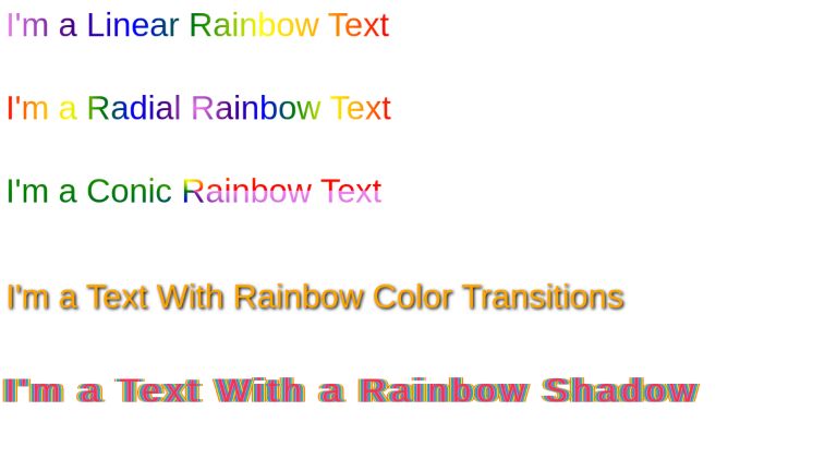
<span class="rainbow-text">I'm a Linear Rainbow Text</span><br>
<span class="rainbow-text">I'm a Radial Rainbow Text</span><br>
<span class="rainbow-text">I'm a Conic Rainbow Text</span><br>

<span class="rainbow-text-loop">I'm a Text With Rainbow Color Transitions</span><br>

<span class="rainbow-text-shadow">I'm a Text With a Rainbow Shadow</span><br>
body { font-family: sans-serif; }

.rainbow-text {
  font-size: 1.5rem;
  background-image: linear-gradient(to right, violet, indigo, blue, green, yellow, orange, red);
 color: transparent;
  -webkit-background-clip: text;
  display: inline-block;
  margin-bottom: 2rem;
}

.rainbow-text:nth-of-type(2) {
   background-image: radial-gradient(circle, violet, indigo, blue, green, yellow, orange, red);
 color: transparent;
}

.rainbow-text:nth-of-type(3) {
   background-image: conic-gradient(from 90deg, violet, indigo, blue, green, yellow, orange, red);
 color: transparent;
}

.rainbow-text-loop {
  font-size: 1.5rem;
  display: inline-block;
  margin-top: 1rem;
  text-shadow: 2px 2px 4px #000000;
  -webkit-animation: rainbow 5s infinite;
}

@-webkit-keyframes rainbow{
  0%{color: orange;}
  10%{color: purple;}
	20%{color: red;}
  30%{color: CadetBlue;}
	40%{color: yellow;}
  50%{color: coral;}
	60%{color: green;}
  70%{color: cyan;}
  80%{color: DeepPink;}
  90%{color: DodgerBlue;}
	100%{color: orange;}
}


.rainbow-text-shadow {
  display: inline-block;
  margin-top: 2.5rem;
  font-size: 1.5rem;
  font-weight: 100;
  color: #ef3550;
  letter-spacing: 8px;
  text-shadow: 1px 0 #f48fb1, 2px 0 #7e57c2, 3px 0 #2196f3, 4px 0 #26c6da, 5px 0 #43a047, 6px 0 #eeff41, 7px 0 #f9a825, 8px 0 #ff5722, -1px 0 #f48fb1, -2px 0 #7e57c2, -3px 0 #2196f3, -4px 0 #26c6da, -5px 0 #43a047, -6px 0 #eeff41, -7px 0 #f9a825, -8px 0 #ff5722;
}
Conclusion
In this article, we went through how we can create variations of rainbow texts using powerful CSS properties. Note that the properties are generic, so the rainbow pattern is one of the many color patterns you can create using these properties.
UnusedCSS helps website owners remove their unused CSS every day. Sign Up to see how much you could remove.