Check your site for unused CSS
Round Buttons
CSS provides a handy property of border-radius, that lets us create round corners for our elements. This brief article will demonstrate how to build aesthetic rounded buttons.
Let’s create a button with an edit icon.
<button class="round">✎</button>Let’s give it a pleasant color, spacing, and a subtle shadow.
button.round {
  background-color: #48abe0;
  color: white;
  border: none;
  padding: 5px;
  font-size: 31px;
  height: 130px;
  width: 130px;
  box-shadow: 0 2px 4px darkslategray;
}
Let’s make our button a perfect circle by applying a border-radius of at least 50%.
button.round {
  // … rest of the styles
  border-radius: 50%;
}
There we go. Let’s give it realistic hover and active state effects with a gentle transition.
button.round {
 // … rest of the styles
 cursor: pointer;
 transition: all 0.2s ease;
}
Let’s change the background color and box-shadow placement when the button is pressed. On top of these, adding a y-axis translate creates a realistic keypress effect.
button.round:hover {
 background-color: #65b9e6;
}

button.round:active {
 box-shadow: 0 0 2px darkslategray;
 transform: translateY(2px);
}
And our button is complete. Try clicking on it!
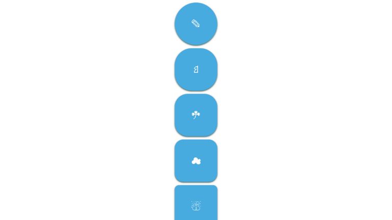
Here is a catalog of buttons with different border radii.
<div class="parent">
  <button class="round-6">✎</button>
  <button class="round-5">♘</button>
  <button class="round-4">☘</button>
  <button class="round-3">☁</button>
  <button class="round-2">☃</button>
  <button class="round-1">☂</button>
  <button>☀</button>
</div>
* {
  font-family: sans-serif;
}

.parent {
  display: flex;
  flex-direction: column;
  align-items: center;
}

button {
  background-color: #48abe0;
  color: white;
  border: none;
  padding: 5px;
  font-size: 31px;
  height: 130px;
  width: 130px;
  box-shadow: 0 2px 4px darkslategray;
  cursor: pointer;
  transition: all 0.2s ease;
}

button:hover {
 background-color: #65b9e6;
}

button:active {
  box-shadow: 0 0 2px darkslategray;
  transform: translateY(2px);
}

button {
  margin-bottom: 10px;
}

.round-1 {
  border-radius: 5%;
}

.round-2 {
  border-radius: 10%;
}

.round-3 {
  border-radius: 20%;
}

.round-4 {
  border-radius: 30%;
}

.round-5 {
  border-radius: 40%;
}

.round-6 {
  border-radius: 70%;
}
Here are some more examples.
A collection of rounded buttons.
See the Pen Rounded buttons by Elena Scherer (@eksch) on CodePen.
Rounded buttons with several hover effects.
See the Pen Button CSS3 effect hover & active by Thibaut (@Thibaut-B) on CodePen.
Simple rounded button with a fancy hover effect.
See the Pen A fancy button by 𝙰𝙽𝙳𝚈 𝚆𝙸𝙻𝙻𝙴𝙺𝙴𝙽𝚂 (@andywillekens) on CodePen.
UnusedCSS helps website owners remove their unused CSS every day. Sign Up to see how much you could remove.