Check how much unused CSS you have on your website:
CSS Wave Animation
Animations and Transitions in CSS can come in handy. They allow objects and effects to have a dynamic behavior. Based on your use case, you may be using animation for (but not limited to) the following purposes:
- General aesthetics
- Visualizations
- State Changes
General Aesthetics
Websites are increasingly becoming immersive to help engage their users. For this purpose, the power of CSS animations/transitions is leveraged. You may have come across websites with scenic backgrounds (clouds, flying birds) that provide apparently little but very subtle and detailed effects to the viewer's eye. You may have switched the dark mode to on and instead of an abrupt switch, observed a gentle transition to the new theme. All these effects leverage animations/transitions.
Visualizations
Animations can be used to demonstrate any 2D/3D visualization of phenomena. One such example is how this website demonstrates the output of a custom bezier curve.
State Changes
This area is very broad. State change can represent updates in any characteristic of any visual component. Examples include but are not limited to
- Slide down Menus
- Disabled buttons getting enabled visually after form changes and vice versa
Should I always use animations?
Animations are handy but not a must. Using too much animation can:
- Compromise the focus of the user. You may want them to be focused on a specific information area but the sideline animation keeps distracting
- Make your website glitchy. Perfectly defining the pixel to pixel state of an animation (especially for infinite/repeating ones) can be challenging and can cause glitches during the animation loop
- Degrade performance on low-end devices
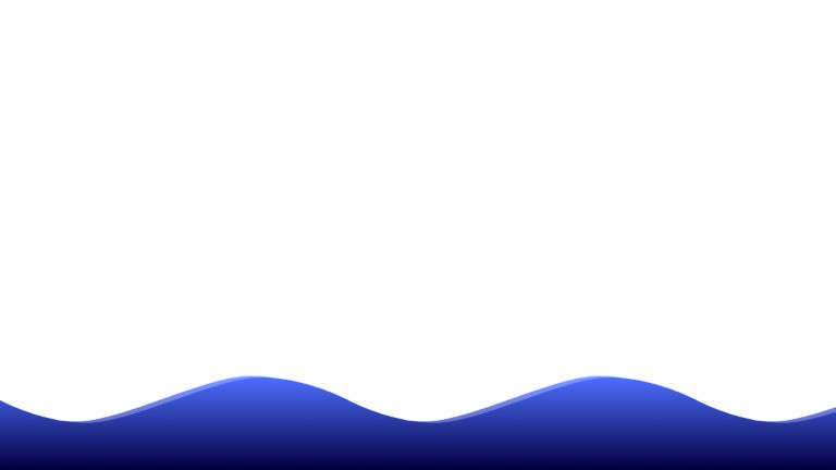
Wave Animation
Let's build a simple wave animation, taking inspiration from this codepen.
The Wave
Constructing a wave-like structure using HTML + CSS is tough, not developer-friendly, and most importantly unnecessary. We can represent/draw such structures using Scalable Vector Graphics - SVGs. Now SVGs are a detailed topic in themselves. Briefly, it is a markup that can represent shapes and their properties in a human and machine-friendly markup. For complex shapes, instead of writing the markup, developers can leverage tools like Inkscape that allow drawing a shape and getting its markup code as output.
Now, we have multiple options regarding how we use the SVG in our code.
- Place the SVG in the HTML code - While this normally does the job, we need to repeat the SVG infinitely on the x-axis for our animation. This can not be achieved with plain HTML.
- Host SVG on cloud and access it using background CSS property - This can work in our case but unlike option 1, it creates an unnecessary network call.
- Inline the SVG code into the CSS background property - This gives us the best of both the above options. We can inline the SVG and also have it replicated infinitely using background-repeat property.
For option 3, we need to encode our SVG. While URL encoding can work, it is not reliable across different browsers. Base64 works perfectly for our use case. Our SVG code looks like this:
<svg viewBox="0 0 174.47064 46.34594" version="1.1" xmlns="http://www.w3.org/2000/svg">
  <defs>
    <linearGradient id="wave-gradient" x1="0%" y1="100%" x2="0%" y2="0%">
      <stop style="stop-color:#00003f;" offset="0" id="deep-ocean" />
      <stop style="stop-color:#4e6fff;" offset="1" id="shallow-ocean" />
    </linearGradient>
  </defs>
  <path style="fill:url(#wave-gradient);fill-rule:evenodd" d="m 0,11.38448 c 0,0 21.133851,11.39531 43.617661,11.38441 C 66.101471,22.75799 107.96856,0.03262
    130.508,7e-5 c 22.53944,-0.0325 43.96264,11.38441 43.96264,11.38441 V 46.34594 H 0 Z" />
</svg>
Its base64 encoding representation looks like this:
PHN2ZyB2aWV3Qm94PSIwIDAgMTc0LjQ3MDY0IDQ2LjM0NTk0IiB2ZXJzaW9uPSIxLjEiIHhtbG5zPSJodHRwOi8vd3d3LnczLm9yZy8yMDAwL3N2ZyI+CiAgPGRlZnM+CiAgICA8bGluZWFyR3JhZGllbnQgaWQ
9IndhdmUtZ3JhZGllbnQiIHgxPSIwJSIgeTE9IjEwMCUiIHgyPSIwJSIgeTI9IjAlIj4KICAgICAgPHN0b3Agc3R5bGU9InN0b3AtY29sb3I6IzAwMDAzZjsiIG9mZnNldD0iMCIgaWQ9ImRlZXAtb2NlYW4iIC
8+CiAgICAgIDxzdG9wIHN0eWxlPSJzdG9wLWNvbG9yOiM0ZTZmZmY7IiBvZmZzZXQ9IjEiIGlkPSJzaGFsbG93LW9jZWFuIiAvPgogICAgPC9saW5lYXJHcmFkaWVudD4KICA8L2RlZnM+CiAgPHBhdGggc3R5bG
U9ImZpbGw6dXJsKCN3YXZlLWdyYWRpZW50KTtmaWxsLXJ1bGU6ZXZlbm9kZCIgZD0ibSAwLDExLjM4NDQ4IGMgMCwwIDIxLjEzMzg1MSwxMS4zOTUzMSA0My42MTc2NjEsMTEuMzg0NDEgQyA2Ni4xMDE0NzEsMj
IuNzU3OTkgMTA3Ljk2ODU2LDAuMDMyNjIgMTMwLjUwOCw3ZS01IGMgMjIuNTM5NDQsLTAuMDMyNSA0My45NjI2NCwxMS4zODQ0MSA0My45NjI2NCwxMS4zODQ0MSBWIDQ2LjM0NTk0IEggMCBaIiAvPgo8L3N2Zz4=
<div class="wave"></div>
.wave {
 background-image: url(data:image/svg+xml;base64,PHN2ZyB2aWV3Qm94PSIwIDAgMTc0LjQ3MDY0IDQ2LjM0NTk0IiB2ZXJzaW9uPSIxLjEiIHhtbG5zPSJodHRwOi8vd3d3LnczLm9yZy8yMDAwL3N2Zy
I+CiAgPGRlZnM+CiAgICA8bGluZWFyR3JhZGllbnQgaWQ9IndhdmUtZ3JhZGllbnQiIHgxPSIwJSIgeTE9IjEwMCUiIHgyPSIwJSIgeTI9IjAlIj4KICAgICAgPHN0b3Agc3R5bGU9InN0b3AtY29sb3I6IzAwMDAzZ
jsiIG9mZnNldD0iMCIgaWQ9ImRlZXAtb2NlYW4iIC8+CiAgICAgIDxzdG9wIHN0eWxlPSJzdG9wLWNvbG9yOiM0ZTZmZmY7IiBvZmZzZXQ9IjEiIGlkPSJzaGFsbG93LW9jZWFuIiAvPgogICAgPC9saW5lYXJHcmF
kaWVudD4KICA8L2RlZnM+CiAgPHBhdGggc3R5bGU9ImZpbGw6dXJsKCN3YXZlLWdyYWRpZW50KTtmaWxsLXJ1bGU6ZXZlbm9kZCIgZD0ibSAwLDExLjM4NDQ4IGMgMCwwIDIxLjEzMzg1MSwxMS4zOTUzMSA0My42MT
c2NjEsMTEuMzg0NDEgQyA2Ni4xMDE0NzEsMjIuNzU3OTkgMTA3Ljk2ODU2LDAuMDMyNjIgMTMwLjUwOCw3ZS01IGMgMjIuNTM5NDQsLTAuMDMyNSA0My45NjI2NCwxMS4zODQ0MSA0My45NjI2NCwxMS4zODQ0MSBWID
Q2LjM0NTk0IEggMCBaIiAvPgo8L3N2Zz4=) repeat-x;
 background-repeat: repeat-x;
 background-size: 500px auto;
 background-position: bottom;
 position: absolute;
 bottom: 0%;
 width: 100%;
 height: 200px;
 z-index: 1;
 animation: wave 5s cubic-bezier(0.36, 0.45, 0.63, 0.53) infinite;
}
Using this basic code, we get an SVG depicting a wave rendered as a background of a div.
For a better visual experience, let’s have 2 waves.
<div class="wave"></div>
<div class="wave"></div>
Let’s add a horizontal flow effect by adding an animation to the background position.
@keyframes wave {
 0% {
 background-position-x: 0%;
 }
 100% {
 background-position-x: -500px;
 }
}
To stimulate the height variation during flow, let’s add movement along the y-axis for the 2nd wave. For this, it would be logical to use the background-position-y property but to align it relative to the bottom we would need to use side-relative values. This didn't seem to work in the most recent version of Chrome, making it a non-starter. The side-relative values do curiously seem to work when using the background-position property.
@keyframes swell {
 0%, 100% {
 background-position: right bottom 10px;
 }

 50% {
 background-position: right bottom 0;
 }
}
This would override our background-position-x property, but we can just put that animation further down the animation list to give it a higher priority instead. Knitting everything up together, we will get our basic wave animation.
HTML Code
<div class="ocean">
  <div class="wave"></div>
  <div class="wave"></div>
</div>
CSS Code
* {
padding: 0;
margin: 0;
}

.wave {
background-image: url("data:image/svg+xml;base64,PHN2ZyB2aWV3Qm94PSIwIDAgMTc0LjQ3MDY0IDQ2LjM0NTk0IiB2ZXJzaW9uPSIxLjEiIHhtbG5zPSJodHRwOi8vd3d3LnczLm9yZy8yMDAwL3N2ZyI+CiAgPGRlZnM+CiAgICA8bGluZWFyR3JhZGllbnQgaWQ9IndhdmUtZ3JhZGllbnQiIHgxPSIwJSIgeTE9IjEwMCUiIHgyPSIwJSIgeTI9IjAlIj4KICAgICAgPHN0b3Agc3R5bGU9InN0b3AtY29sb3I6IzAwMDAzZjsiIG9mZnNldD0iMCIgaWQ9ImRlZXAtb2NlYW4iIC8+CiAgICAgIDxzdG9wIHN0eWxlPSJzdG9wLWNvbG9yOiM0ZTZmZmY7IiBvZmZzZXQ9IjEiIGlkPSJzaGFsbG93LW9jZWFuIiAvPgogICAgPC9saW5lYXJHcmFkaWVudD4KICA8L2RlZnM+CiAgPHBhdGggc3R5bGU9ImZpbGw6dXJsKCN3YXZlLWdyYWRpZW50KTtmaWxsLXJ1bGU6ZXZlbm9kZCIgZD0ibSAwLDExLjM4NDQ4IGMgMCwwIDIxLjEzMzg1MSwxMS4zOTUzMSA0My42MTc2NjEsMTEuMzg0NDEgQyA2Ni4xMDE0NzEsMjIuNzU3OTkgMTA3Ljk2ODU2LDAuMDMyNjIgMTMwLjUwOCw3ZS01IGMgMjIuNTM5NDQsLTAuMDMyNSA0My45NjI2NCwxMS4zODQ0MSA0My45NjI2NCwxMS4zODQ0MSBWIDQ2LjM0NTk0IEggMCBaIiAvPgo8L3N2Zz4=");
background-repeat: repeat-x;
background-size: 500px auto;
background-position: bottom;
position: absolute;
bottom: 0%;
width: 100%;
height: 200px;
animation: wave 5s cubic-bezier(0.36, 0.45, 0.63, 0.53) infinite;
z-index: 1;
}

.wave:nth-of-type(2) {
opacity: 0.7;
animation: swell 5s ease -1.25s infinite, wave 5s cubic-bezier(0.36, 0.45, 0.63, 0.53) -.125s infinite;
z-index: 0;
}

@keyframes wave {
0% {
background-position-x: 0%;
}
100% {
background-position-x: -500px;
}
}

@keyframes swell {
0%, 100% {
background-position: right bottom 10px;
}
50% {
background-position: right bottom 0;
}
}
This is a basic wave animation.
Let’s take a look at some of the enhanced implementations.
This codepen depicts a wave with a fast ripple effect. The physics is well articulated and the liquid effect is very real.
See the Pen Pure CSS wave animation by raykuo (@raykuo) on CodePen.
This one presents an example similar to what we constructed. The waves are replicated and their opacity is manipulated to give z-axis visual depth.
See the Pen CSS wave animation by P. Rachel (@Prachl) on CodePen.
We see something similar to the above example in the following
See the Pen Waves by Pushkar Anand (@pushkar8723) on CodePen.
Conclusion
There are many ways and perspectives to construct a wave animation. The fundamental idea focuses on simulating the physics of waves by animating the following properties:
- Position
- Size
- Opacity
But waves are not the only thing you can depict with creative engineering of the above properties - nor are these the only ones available for animation. Using more right tools in the right way, you can create animations that can present any phenomena with details and precision. Credits to the power of CSS.
UnusedCSS helps website owners remove their unused CSS every day. Sign Up to see how much you could remove.