Check how much unused CSS you have on your website:
Animated Dropdown Menu
Dropdown menus have always been useful. They contain information that is required only when the user wants it. While the information is always helpful, it might not be feasible or relevant to have it displayed all the time. Hence, it can be wrapped in an invisible container and displayed only when the user requires it. Once the user has gone through the information to their benefit, it hides again.
For example, consider filing a form that requires you to select the city you are a resident of. You can select it from a dropdown that, say, contains 100 cities. Now, displaying all the 100 cities all the time will compromise the user experience. The appropriate solution is to wrap this in a dropdown that expands when the user clicks on it and collapses when the user clicks outside it.
Similarly, you can find dropdown menus on most web pages that offer a good deal of information in the navigation bar. The information can be extensive so dropdown menus used with relevant context come in very handy.
Let’s build a simple navigation menu containing a dropdown element.
The breakdown of the steps we will be doing is as follows:
- Create a simple navbar with an element that pops down some content as dropdown
- Create an element containing the dropdown content below the dropdown-trigger element created in the first step. Give the list element a max-height of 0px so that it is not visible by default.
- When the user hovers the first element, give the list a max-height greater than what its height can be. We use max-height instead of height as later would require hardcoding and will not be responsive.
Based on the above, users will see the list only when they hover over it, observing a dropdown effect. We can also use display property to achieve the same but since it has no states between display: none; and display: block;, the effect is not animate-able for a transition. The content will just abruptly appear and disappear. The height attribute, on the other hand, can go from 0 to the required value, creating a smooth transition.
Let’s start writing it in code.
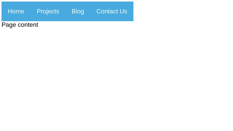
<nav role="navigation">
 <ul>
 <li><a href="#">Home</a></li>
 <li class="dropdown"><a href="#" aria-haspopup="true">Projects</a>
 <ul class="dropdown-content" aria-label="submenu">
 <li><a href="#">Project-1</a></li>
 <li><a href="#">Project-2</a></li>
 <li><a href="#">Project-3</a></li>
 </ul>
 </li>
 <li class="dropdown"><a href="#" aria-haspopup="true">Blog</a>
 <ul class="dropdown-content" aria-label="submenu">
 <li><a href="#">Article-1</a></li>
 <li><a href="#">Article-2</a></li>
 <li><a href="#">Article-3</a></li>
 </ul>
 </li>
 <li><a href="#">Contact Us</a></li>
 </ul>
</nav>
<div class="content">
 Page content
</div>
For the purposes of readability, we’ll be omitting stylistic code and showcasing the minimal one required for achieving the desired functionality. Complete style code will follow in the demo codepen.
.dropdown-content {
 min-width: max-content;
 max-height: 0;
}
When the dropdown triggers are hovered, focused, or focused within (i.e. focus is on any of its descendant elements or itself), we want the dropdown lists to be displayed. More on focus-within.
.dropdown-content {
  // ...
  transition: max-height 1s;
}

/* The max-height should be set to something that will always be a little bit bigger than the height of the content. */
.dropdown:hover .dropdown-content,
.dropdown:focus .dropdown-content,
.dropdown:focus-within .dropdown-content {
  max-height: 200px;
}
Mobile-Friendly Layout
To make our implementation mobile-friendly, let’s implement the styles for mobile resolution using media query.
/* This makes the top-level navigation horizontal on desktop, and vertical on smaller screens. */
@media screen and (min-width: 768px) {
  nav > ul > li {
    float: left;
  }

  .dropdown {
    position: relative;
  }

  .dropdown-content {
    position: absolute;
    width: max-content;
  }

  .content {
    clear: both;
  }
}
With as minimal implementation as above, we achieve a dropdown list that displays and hides based on the user’s interaction.
<nav role="navigation">
  <ul>
    <li><a href="#">Home</a></li>
    <li class="dropdown"><a href="#" aria-haspopup="true">Projects</a>
      <ul class="dropdown-content" aria-label="submenu">
        <li><a href="#">Project-1</a></li>
        <li><a href="#">Project-2</a></li>
        <li><a href="#">Project-3</a></li>
      </ul>
    </li>
    <li class="dropdown"><a href="#" aria-haspopup="true">Blog</a>
      <ul class="dropdown-content" aria-label="submenu">
        <li><a href="#">Article-1</a></li>
        <li><a href="#">Article-2</a></li>
        <li><a href="#">Article-3</a></li>
      </ul>
    </li>
    <li><a href="#">Contact Us</a></li>
  </ul>
</nav>

<div class="content">
  Page content
</div>
body {
	font-family: sans-serif;
}

/* Set the style for the navigation menus */
nav ul {
	list-style: none;
	margin: 0;
	padding-left: 0;
}

nav a {
  text-decoration: none;
	color: #fff;
  background: #48abe0;
	padding: 1rem;
  transition: background 0.5s;
  display: block;
  outline: 0;
}

nav a:hover,
nav li:focus-within > a {
	background: #245975;
	cursor: pointer;
}

/* Make the dropdown animate. */
.dropdown-content {
  min-width: max-content;
  overflow: hidden;
  max-height: 0;
  transition: max-height 1s;
}

/* The max-height should be set to something that will always be a little bit bigger than the height of the content. */
.dropdown:hover .dropdown-content,
.dropdown:focus .dropdown-content,
.dropdown:focus-within .dropdown-content {
  max-height: 200px;
}

/* This makes the top-level navigation horizontal on desktop, and vertical on smaller screens. */
@media screen and (min-width: 768px) {
  nav > ul > li {
    float: left;
  }

  .dropdown {
    position: relative;
  }

  .dropdown-content {
    position: absolute;
    width: max-content;
  }

  .content {
    clear: both;
  }
}
This implementation is just one of the countless possible implementations. Let’s take a look at more of them.
Examples
Note: Open the codepens to full page width for better observability and layout. Click on "Edit on Codepen" to navigate to full page codepen.
A simple navbar menu.
See the Pen Simple menù by Simone (@CrazyArtist) on CodePen.
Another stylistic, pure CSS menu.
See the Pen Pure CSS DropDown Menu by Dr. Web (@drweb) on CodePen.
Another simple menu with background color transition.
See the Pen Dropdown on hover CSS3 animation by Nune (@ANune) on CodePen.
A compilation of 10 different animations based on Translation, Rotation, and Scaling along the x, y, and z axes.
See the Pen Dropdown Animations with CSS Transforms by Cody Pearce (@codypearce) on CodePen.
Conclusion
The effects, transitions, and animations that we can apply on dropdown menus are essentially limitless - credit to the power of HTML and CSS. As noted in this article - translation, scale, and rotation are powerful attributes for creating simple, but smart dropdown transitions that react to users' actions and engage them in a meaningful manner.
UnusedCSS helps website owners remove their unused CSS every day. See how much you could save on your website: