Need to improve your PageSpeed score? Enter your website address to see how much CSS you can remove:
Drawing Triangles with CSS
At some point, most of the front-end developers have had to search about drawing triangles. It can be a bit challenging, as CSS by default represents everything as a rectangle. On the brighter side, it also offers more than one way to generate triangles. This article will go through a series of examples.
Selective Borders
CSS borders are triangle shaped, by default. If we have an element with zero physical dimensions and a thick border on all four sides with unique colors, we will observe that the borders are just 4 triangles clamped together. Let’s see it in action.
We create an empty element and give it four, thick borders with unique colors.
<div class="empty-element"></div>
 .empty-element {
 width: 0px;
 height: 0px;
 border: 150px solid;
 border-color: #A569BD #48C9B0 #48abe0 #F4D03F;
}
As observed, the output is nothing more than 4 triangles sharing a common point, but we just want the bottom border here.
Let's start by setting the top border-width to 0:
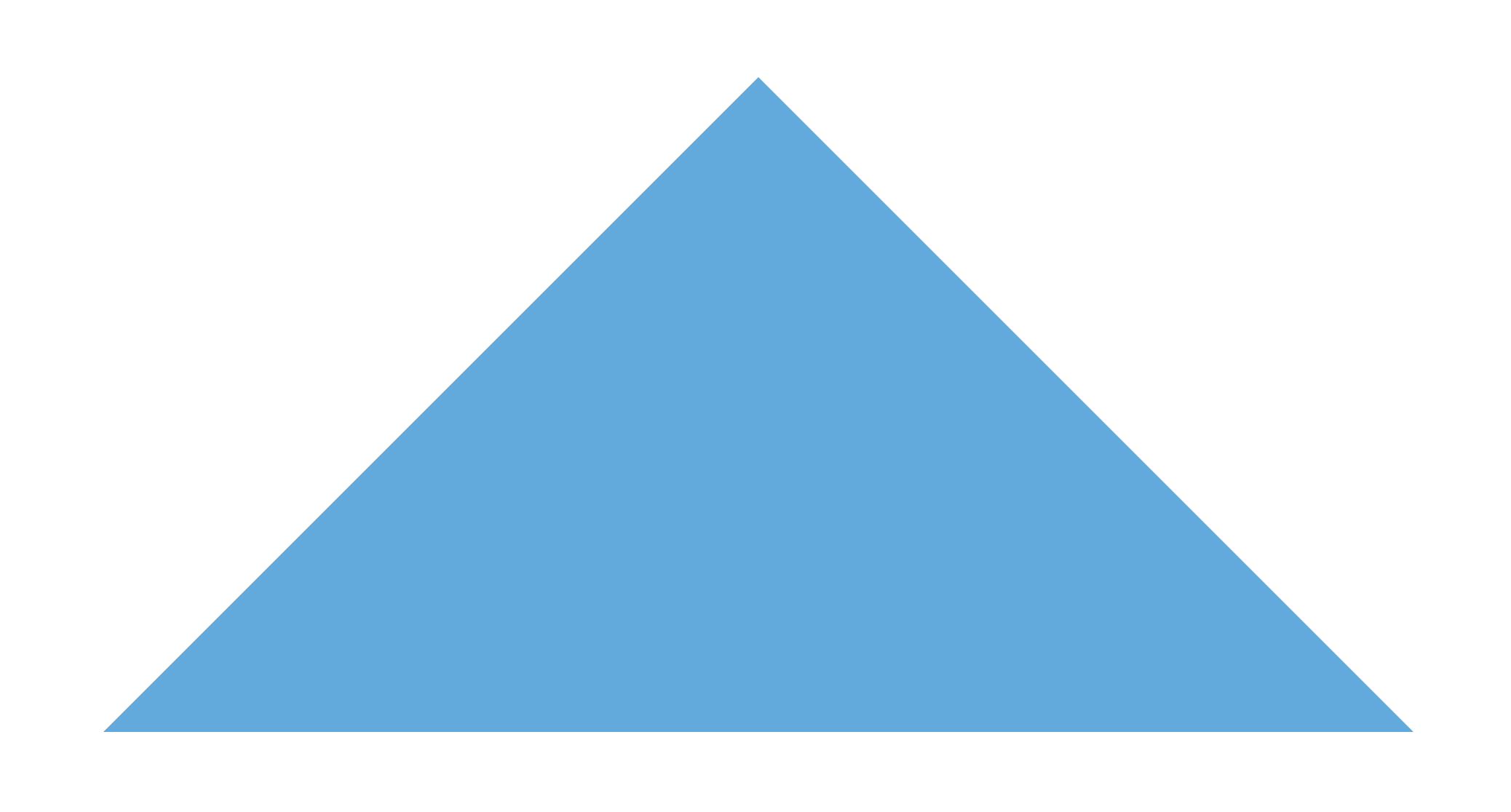
border-width: 0 150px 150px 150px;To get rid of the yellow and green borders, we can use a transparent color for them.
border-color: transparent transparent #48abe0 transparent;
To make triangles that point diagonally, we can just set another border width to 0. Let's set the top and left borders to 0:
border-width: 0 150px 150px 0;Now we can make triangles pointing in 8 different directions:
border-color: transparent transparent #48abe0 transparent;
border-width: 0 150px 150px 150px;
border-color: #48abe0 transparent transparent transparent;
border-width: 150px 150px 0 150px;border-color: transparent #48abe0 transparent transparent;
border-width: 150px 150px 150px 0;border-color: transparent #48abe0 transparent transparent;
border-width: 150px 0 150px 150px;border-color: #48abe0 transparent transparent transparent;
border-width: 150px 0 0 150px;.point-up-left {
border-color: #48abe0 transparent transparent transparent;
border-width: 150px 150px 0 0;
}.point-down-right {
border-color: transparent transparent #48abe0 transparent;
border-width: 0 0 150px 150px;
}.point-down-right {
border-color: transparent transparent #48abe0 transparent;
border-width: 0 150px 150px 0;
}If you want to use this method to create triangles pointing in arbitrary directions, then it can require some more complicated maths to get the transformations right. You can use our triangle generator to generate it for you instead. Then you can generate all sorts of triangles such as this:
Path Clipping
CSS offers a powerful property named clip-path. This property enables you to take an HTML element and draw a region over it. The content inside the region will be visible while the rest will be hidden. This property offers a range of default regions that span shapes, custom path elements, custom SVGs, and attributes of CSS Box-Model. We can use the polygon function to draw a triangle over our element by providing 3 coordinates that combine to make a triangle.
Let’s create an element and set a background image on it.
<div class="bg-image-triangle"></div>.bg-image-triangle {
width: 175px;
height: 175px;
margin: auto;
object-fit: cover;
background-image: url("https://images.unsplash.com/photo-1466637574441-749b8f19452f?ixlib=rb-1.2.1&ixid=MnwxMjA3fDB8MHxwaG90by1wYWdlfHx8fGVufDB8fHx8&auto=format&fit=crop&w=1760&q=80");
background-size: cover;
}
Next, we only need to clip a triangle out of it. We will draw a polygon on it with 3 points. The Polygon function, in our case, will take 3 coordinates as percentages from the origin. The origin is the top left corner of the element. So x values will travel from that point towards the right direction while the y values will travel downwards. For example, a red dot drawn at (30%, 70%) will land at the place shown in the following image:
Let’s choose 3 points that will form the triangle of our requirement. We take the values (50% 0%), (0% 100) and (10%, 100%). The markers at these points will look as follows:
Let’s clip our element to the content (triangle) inside these points.
.bg-image-triangle {
  /*... rest of the styles from above*/
  clip-path: polygon(50% 0%, 0% 100%, 100% 100%);
}
And we get our triangle.
You can also use our clip-path generator to generate the required property value for you.
Creating a Triangle having a Background Gradient
We can reuse path clipping to clip out a triangle from a gradient.
<div class="triangle-linear-gradient-bg">
</div>
.triangle-linear-gradient-bg {
width: 150px;
height: 150px;
margin: auto;
background: linear-gradient(#48abe0 0%, #8240c5 100%);
clip-path: polygon(50% 0%, 0% 100%, 100% 100%);
}Creating a Bordered Triangle
Let’s suppose we have a requirement to build a triangle that has a border of a different color. Following is the expected output.
We can build such a bordered triangle as a combination of 2 triangles, one on top of the other. We will use a single HTML element though. The border triangle will go as its main styling, while the inner triangle will be the styling of its ::after pseudo-element child. We will use the same technique of drawing 3 transparent and 1 colored border. The child triangle will have a border width less than the parent's width. The difference in border width will be the exact value of the required border thickness. And we will use absolute positioning with top and left offsets to adjust the positioning of the child triangle over the parent triangle.
<div class="triangle-border triangle-border-inner"></div>.triangle-border {
position: relative;
width: 0;
border-color: transparent transparent black transparent;
border-width: 101px 101px 101px 101px;
border-style: solid;
margin: auto;
margin-top: -70px;
}
.triangle-border-inner:after {
position: absolute;
top: -98px;
left: -99px;
content: "";
width: 0;
border-color: transparent transparent #43abe0 transparent;
border-width: 99px 99px 99px 99px;
border-style: solid;
margin: auto;
}And we are done. We have the bordered triangle.
Box Shadow for Path Clipped Triangles
If you are drawing your triangle using path clipping and want to have a box-shadow for the triangle, you will encounter the problem of the box-shadow not being rendered around the triangle. This is because clip-path clips out shadow as well. You could apply the box-shadow to a wrapper around your triangle. But since, by default, everything is a box in CSS, the shadow will be rectangular. You can fix this by using the drop-shadow filter on the wrapper, which shrinks the shadow of the parent and wraps it perfectly to the child.
<div class="triangle-wrapper">
<div class="triangle-linear-gradient-bg">
</div>
</div>.triangle-wrapper {
filter: drop-shadow(5px 5px 5px rgba(0, 0, 0, 0.3));
}
.triangle-linear-gradient-bg {
  width: 150px;
  height: 150px;
  margin: auto;
  background: linear-gradient(#48abe0 0%, #8240c5 100%);
  clip-path: polygon(50% 0%, 0% 100%, 100% 100%);
}There we go. We have a path-clipped triangle with an accurately wrapping shadow.
Drawing A Triangle Using 2 Gradients
We can also create a triangle by applying 2 diagonal gradients to an element. Each diagonal will form half of the triangle. Thus, we want our gradients to be half transparent and cover only 50% width of the element.
The following example uses 2 gradients with different colors to demonstrate how the triangle is formed. The blue gradient is a half-width gradient in the bottom-right direction placed in the left half of the element while the purple gradient is directed bottom-left and placed in the right half of the element. The results may not be super precise across different rendering engines, and you may see a gap line of one pixel or a half where the 2 gradients meet. It also has the problem that if the aspect ratio of the element changes at all, then the triangle won’t resize itself to fit.
Note: Transparent borders and path-clipping are relatively easier ways of drawing a triangle. They are also not prone to leaving half-pixel gaps down the middle.
<div class="triangle-double-bg-gradients"></div>.triangle-double-bg-gradients {
width: 150px;
height: 150px;
margin: auto;
background-image: linear-gradient(
to bottom right,
transparent 0 50%,
#48abe0 50% 100%
),
linear-gradient(
to bottom left,
transparent 0 50%,
#8240c5 50% 100%
);
background-size: 50% 100%;
background-repeat: no-repeat;
background-position: left, right;
}You can experiment with this in our Gradient Generator.
Conclusion
Drawing triangles in CSS can be a bit challenging. But the good news is that CSS offers a lot of ways to draw them. This article has compiled a series of different methods.
UnusedCSS helps website owners remove their unused CSS every day. Sign Up to see how much you could remove.