Want to know how much unused CSS is on your website? Find out here:
A Guide To CSS Text Wrapping
Note: This article is focused on the semantics of the English Language as the Writing System. Other systems, especially CJK (Chinese Japanese Korean) have conventions and overflow requirements that vary from English and are out of the scope of this article.
Text Wrapping
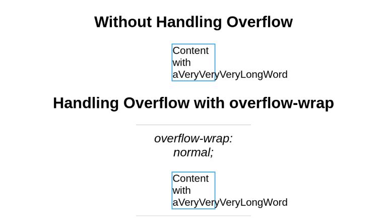
In CSS, overflow is the scenario when the content inside a fixed-width container, is wider than the container’s width. The default behavior of CSS is to render the content flowing out of the container. This may look ugly but this helps the developer see the issue and fix it - instead of the issue getting hidden which can cause potential missing information for the user. For example, a form submission button overflowing and becoming inaccessible. So to avoid such issues, CSS by default prevents Data Loss.
Content overflowwwwwwwwwww
CSS offers multiple capabilities to fix this issue.
Property: overflow-wrap (alias word-wrap)
This property applies to inline elements. It determines whether the browser should break an otherwise unbreakable string to avoid it from overflowing its parent’s width.
It has the following possible keyword values.
- normal
- Anywhere
- break-word
overflow-wrap: normal
When set to normal, the browser will break the string on default/natural opportunities, such as a blank space or a hyphen (‘-’) character. It will also leverage soft-hyphen entity ­ to break.
This is the initial value of the overflow-wrap property. So by default, every string will be broken at soft wrap opportunities, if any, on overflow.
This is how ‘ContentOverflowing’ and ‘Content-Overflowing’ will be handled.
ContentOverflowing
Content-Overflowing
overflow-wrap: anywhere;
This value allows the browser to break the string anywhere to avoid overflow.
Consider the following scenario with the default overflow-wrap: normal; value for a fixed-width container.
ContentOverflow
There is no blank space, a hyphen, or any other soft wrap opportunity in the string. Therefore, it overflows. If we apply overflow: anywhere;, we get the following, wrapped result.
ContentOverflow
overflow-wrap: break-word;
It behaves the same as overflow-wrap: anywhere;. The difference is that the former does not consider soft-wrap opportunities when calculating min-content intrinsic sizes. In case you have not explored extrinsic vs intrinsic sizing, Ahmed Shadeed provides a great resource. It breaks only those words which have a width smaller than the available width.
Content is Overflowing
Property: word-break
CSS offers another property, word-break for handling the same issue - overflows.
It has the following keyword values
- normal
- break-all
- keep-all
- break-word
word-break: normal;
Words will break at the default rules - such as a blank space, a hyphen, etc.
This is how ‘ContentOverflow’ and ‘Content-Overflow’ will be handled.
ContentOverflow
Content-Overflow
word-break: break-all;
Break the word at the point it overflows. It does not take into account if placing the overflowing word onto the next line will eliminate the overflow in the first place or not. This doesn’t apply to CJK writing systems.
ContentOverflow
word-break: keep-all;
For Non-CJK systems, the behavior is the same as word-break: normal.
ContentOverflow
word-break: break-word;
It has the same effect that word-break: normal; and overflow-wrap: anywhere; has. But unlike word-break: break-all; , it takes into account if placing the overflowing word onto the next line will eliminate the overflow.
For example, let’s see how word-break: break-word; handles the following scenario:
Content is Overflowing Again
We observe that the whole word ‘Overflowing’ was moved onto the next line instead of breaking as it can fit the available width without overflowing. If we apply word-break: break-all; to it, this is what we get:
Content is Overflowing Again
The word ‘Overflowing’ was broken at exactly the point where it otherwise caused the overflow. And it was not considered if moving it onto the next line eliminated the overflow or not.
overflow-wrap vs word-break
At a high level, both properties solve the same issue. But, a key difference lies in how both the properties approach the issue and the subtle aesthetic variation in their outcomes.
To visualize, consider a fixed and short-width container for the test “A Very LongWordThatHasNoBreakingPossibilities”.
A Very LongWordThatHasNoBreakingPossibilities
Let’s solve the overflow with overflow-wrap: break-word;.
A Very LongWordThatHasNoBreakingPossibilities
Now, let’s solve it with word-break: break-all;.
A Very LongWordThatHasNoBreakingPossibilities
Notice the difference? word-break: break-all; breaks the word even if placing the word on the next line would eliminate the need for breaking. This prevents large gaps before the breaks - and produces visually better results. The difference is more clearly visible in the overflow-wrap: anywhere; vs word-break: break-all; case. A case of the apparently twin properties. Consider you have a very short space to squeeze in a checkbox and a text which can not fit on the same line without overflowing. This is how the outcome looks like with overflow-wrap: anywhere;:
Photosynthesis
We observe that a lot of real estate beside the checkbox has been left unutilized. A better fix is provided by word-break: break-all;:
Photosynthesis
As observed, word-break discards the possibility of the word fitting the next line and prefers optimizing the usage of available real estate - this is often the better adjustment visually.
The above example receives its inspiration from MDN’s resource on text wrapping.
Summary
| Property | Value | Behavior | When To Use | Example |
|---|---|---|---|---|
overflow-wrap |
normal |
Break at natural line breakpoints such as blank space, a hyphen | When overflow is determined to not be a possibility |
Content |
anywhere |
Break between any 2 characters where the overflow occurs and consider soft wrap opportunities when calculating the min-content intrinsic sizes | When overflow should be handled by breaking long words. As discussed, the alternative option of word-break: break-all; produces visually better results |
ContentOverflow |
|
break-word |
Break between any 2 characters but do not consider soft wrap opportunities when calculating the min-content intrinsic sizes | When overflow should be handled by breaking only those words which have a width smaller than the available width |
Content is Overflowing |
|
word-break |
normal |
Break at default rules | When overflow is determined to not be a possibility |
Content |
break-all |
Break exactly where the content overflows | When overflow should be handled by breaking text exactly at the point of overflow - even if placing the word on a new line eliminates the overflow |
Content is Overflowing Again |
|
break-word |
Same as word-break: normal; and overflow-wrap: anywhere; - Break can create gaps unlike word-break: break-all; |
When placing the overflowing word onto the next line eliminates overflow. This can cause gaps. |
Content is Overflowing Again |
Examples
Here are examples from the above summary in a codepen to help demonstrate what the CSS code should look like:
<section class="centered">
  <h2>Without Handling Overflow</h2>
<div>Content with aVeryVeryVeryLongWord</div>
<!---->

<h2>Handling Overflow with overflow-wrap</h2>

<h3>overflow-wrap: normal;</h3>
<div class="ow-normal">Content with aVeryVeryVeryLongWord</div>

<h3>overflow-wrap: anywhere;</h3>
<div class="ow-anywhere">Content with aVeryLongWordThatDoesNotFit</div>

<h3>overflow-wrap: break-word;</h3>
<div class="ow-break-word">Content with aVeryLongWordThatDoesNotFit</div>
<!---->

<h2>Handling Overflow with word-break</h2>


<h3>word-break: normal;</h3>
<div class="wb-normal">Content with aVeryVeryVeryLongWord</div>

<h3>word-break: break-all;</h3>
<div class="wb-break-all">Content with aVeryLongWordThatDoesNotFit</div>

<h3>word-break: break-word;</h3>
<div class="wb-break-word">Content with aVeryLongWordThatDoesNotFit</div>
</section>
* { font-family: sans-serif; }

section.centered { text-align: center; }

div {
  display: inline-block;
  width: 130px;
  border: 3px solid #48abe0;
  text-align: left;
}

.ow-normal {
  overflow-wrap: normal;
}

.ow-anywhere {
  overflow-wrap: anywhere;
}

.ow-break-word {
  overflow-wrap: break-word;
}

.wb-normal {
  word-break: normal;
}

.wb-break-all {
  word-break: break-all;
}

.wb-break-word {
  word-break: break-word;
}

h3 {
  font-weight: normal;
  font-style: italic;
  border-top: 1px solid #b5b5b5;
  width: 30%;
  margin-left: auto;
  margin-right: auto;
  margin-top: 20px;
  padding-top: 20px;
}
Conclusion
This article has scratched the surface of text-wrapping. Wrapping in itself is a deeper topic as it is tightly coupled to the semantics of the target language. Moreover, it is becoming common to offer web content in multiple languages - aka Internatiolaisation/ Localisation - which makes learning it more important than before for the developers.
UnusedCSS helps website owners remove their unused CSS every day. Sign Up to see how much you could remove.