HTML Line Dividers

The content on a webpage, especially if academic in nature, can be composed of multiple topics and their subtopics. A decent way to indicate the transitions between topics is to use a visual separator element. The purpose of the separator element is to inform the user that the current topic/subtopic is concluding, and now a new topic will be discussed. For example - scenes of a play, scenarios in a novel, paras in an essay. You may be writing a blog on multiple concepts, and when one concept ends, you need a visual separator, etc.
For this purpose of visual separation, HTML provides an <hr> element. It is a short form for ‘Horizontal Rule’ and as per w3Schools, indicates a ‘Thematic Change’ - a formal term for describing what we have already discussed - the transition of content topic.
The horizontal rule, by default, is a plain horizontal line with the following default styles.
hr {
  display: block;
  margin-top: 0.5em;
  margin-bottom: 0.5em;
  margin-left: auto;
  margin-right: auto;
  border-style: inset;
  border-width: 1px;
}
You can see it in action here. This element is by definition, a full fledge HTML element like any other (p, div, etc) and supports Global Attributes and Global Events. Hence, you can style its appearance just like any other customizable element having a block display.
Let’s see some basic examples of dividers.
Using the hr tag plainly will render the default styled divider as seen above.
Default Line Divider
<hr>

Dashed Line Divider
<hr class="dashed">

Dotted Line Divider
<hr class="dotted">

Double Line Divider
<hr class="double">
hr.dashed {
 border-top: 1px dashed;
 border-bottom: none;
}

hr.dotted {
 border-top: 1px dotted;
 border-bottom: none;
}

hr.double {
 border-top: 3px double;
 border-bottom: none;
}
By now you would have observed that divider is nothing but a plain HTML element with border(s) and no inner content. This is why we used the border-top property to apply different styles (which accordingly were different values of supported borders). And we applied border-bottom: none; style to remove repetition of the border which in this case increases the thickness of the border. This style is also the fix for a faint bottom line when the output is seen using Chrome.
So far, we have seen limited border styling options as we relied on the border value. What if you want a custom-themed divider that is visually better aligned with a vibrant theme of your site? The answer is making your own dividers. Let’s see how.
Divider is nothing but a partitioning element that has specific dimensions. You can create an empty div with the dimensions you need, and give it a background of your choice. Since now you’ll be leveraging the background property, you get all the amazing flexibility and power of this property. For instance, let’s build a divider with a gradient.
<hr class="gradient">
hr.gradient {
  height: 3px;
  border: none;
  border-radius: 6px;
  background: linear-gradient(
    90deg,
    rgba(13, 8, 96, 1) 0%,
    rgba(9, 9, 121, 1) 21%,
    rgba(6, 84, 170, 1) 51%,
    rgba(0, 255, 113, 1) 100%
  );
}
The style options with background property are infinite. You can develop all that goes with your theme. You can even use background images depending on your use case. Using an image might not be a great option, but it is nevertheless on the table of possibilities.
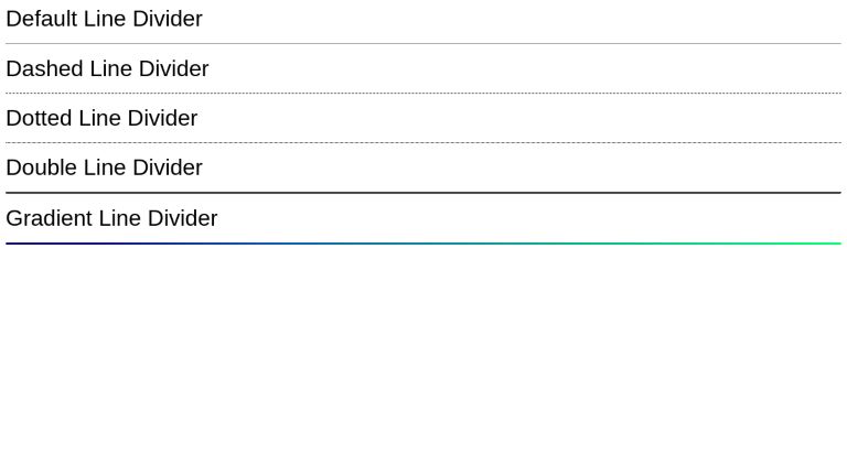
Default Line Divider
<hr class="default">
Dashed Line Divider
<hr class="dashed">
Dotted Line Divider
<hr class="dotted">
Double Line Divider
<hr class="double">
Gradient Line Divider
<hr class="gradient">
body {
  font-family: sans-serif;
}

hr.dashed {
  border-top: 1px dashed;
  border-bottom: none;
}

hr.dotted {
  border-top: 1px dotted;
  border-bottom: none;
}

hr.double {
  border-top: 3px double;
  border-bottom: none;
}

hr.gradient {
  height: 3px;
  border: none;
  border-radius: 6px;
  background: linear-gradient(
    90deg,
    rgba(13, 8, 96, 1) 0%,
    rgba(9, 9, 121, 1) 11%,
    rgba(6, 84, 170, 1) 31%,
    rgba(0, 255, 113, 1) 100%
  );
}
Conclusion
Dividers improve the presentation of a website or webpage’s content by marking transitions, topic changes, etc. HTML offers an <hr> tag out-of-the-box for this purpose. We can style <hr> tag with different values of border property to get variations of fundamental types. For increasing the range of style options, we can use empty divs as custom dividers.